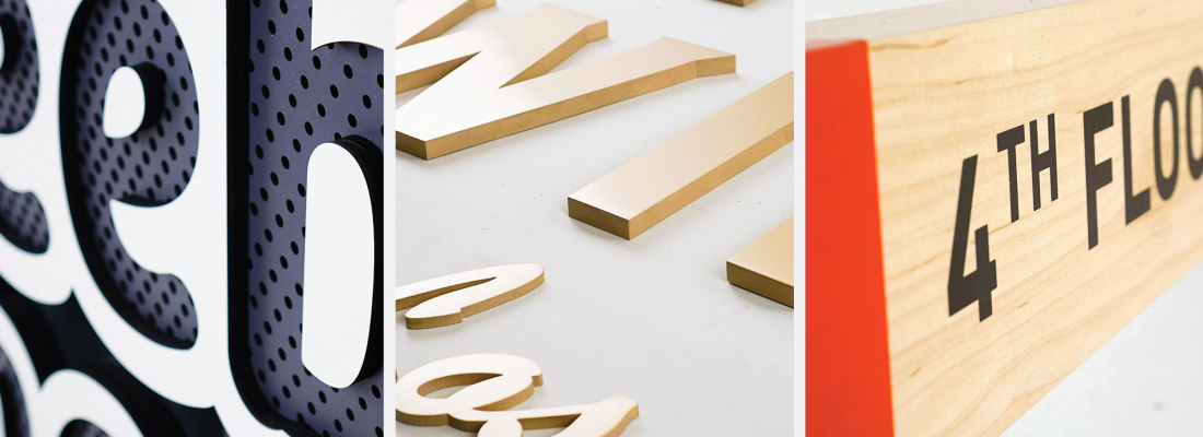
We’ve shipped more than 305 signs in the last 12 weeks, but here are the top ten designs from our customers that pushed the limits.
Read on to see how a sign that defies gravity, 39 lbs of solid bronze, and a jumbo sign containing perfectly placed perforations challenged us in more ways than one.
10. An interactive piece that drives traffic
Adding depth and texture to their sign invites people to interact with this tradeshow sign—and hopefully, start a conversation. See project »
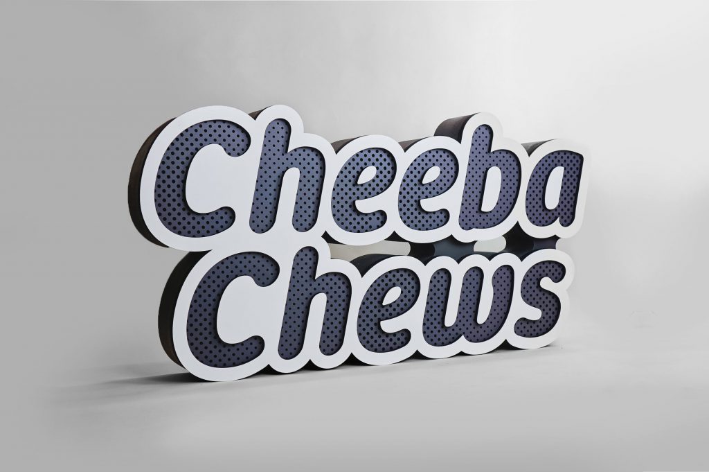
9. An illuminated sign that goes with you
This simple sign is hefty enough to look like a permanent fixture, but can be moved in an instant. See project »
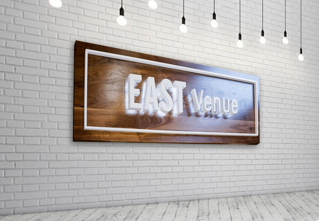
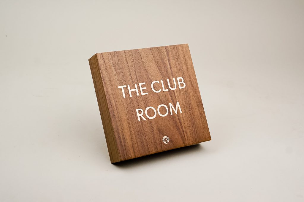
8. Signage that elevates a space
A beautiful slab of solid walnut can instantly elevate the look and feel of a space. See project »
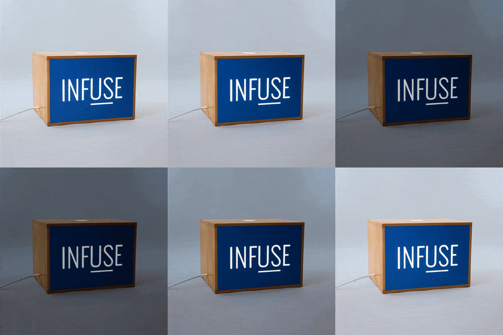
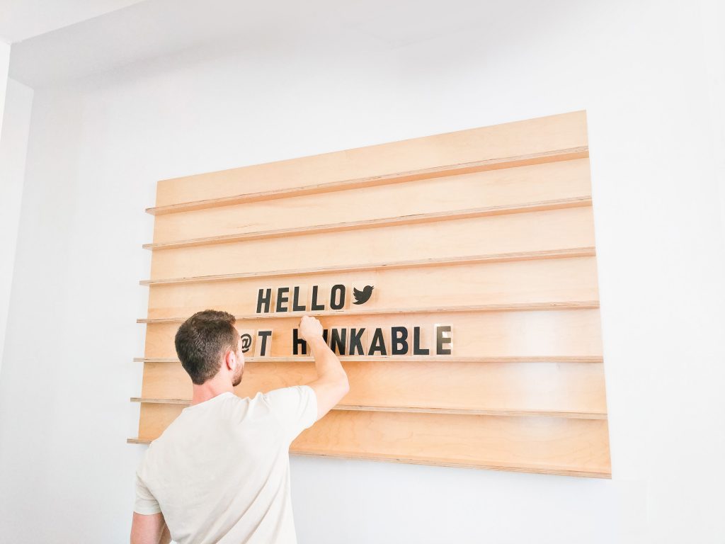
7. A sign that changes daily
A changeable sign allows edits to a menu, schedule, or announcement at a moment’s notice. See project »
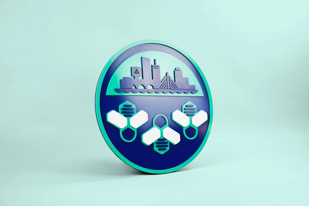
6. A sign for every office location around the world.
Each sign in this series featured a different city skyline, representing the city where the office is located. See project »
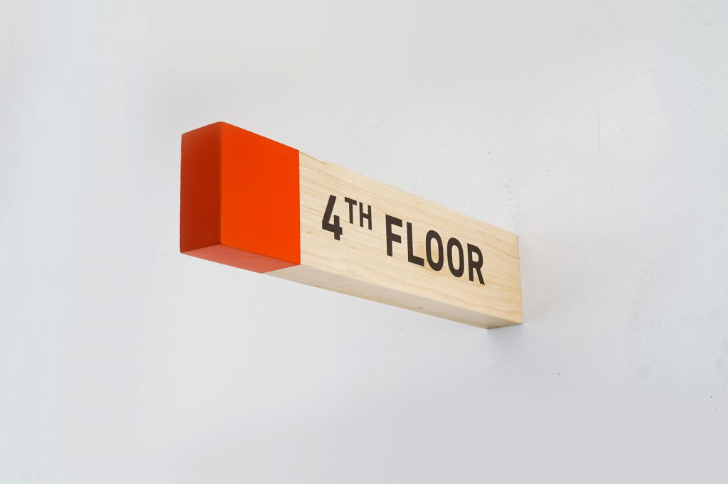
5. Gravity-defying signs
These wayfinding signs for Biolite are both eye-catching—and out of the way. See project »
4. Breathing life into a space
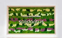
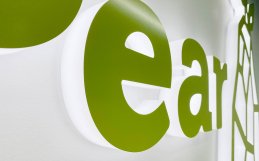
A cheery illuminated sign and a burst of bright greenery breathes life into this space. See project »
3. Going old school
We love our customer’s choice of brass inlay for the artwork, which blends right into their retro interior. See project »
2. (Not) hitting a brick wall
Wires are almost always hidden behind drywall for illuminated signs—but a brick wall didn’t stop our customer. While the wires are visible, they’re designed to be as minimal as possible. See project »

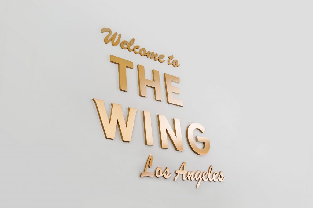
1. 39 pounds of pure, solid bronze
There’s nothing quite like the classic look (or massive weight) of solid bronze. See project »
