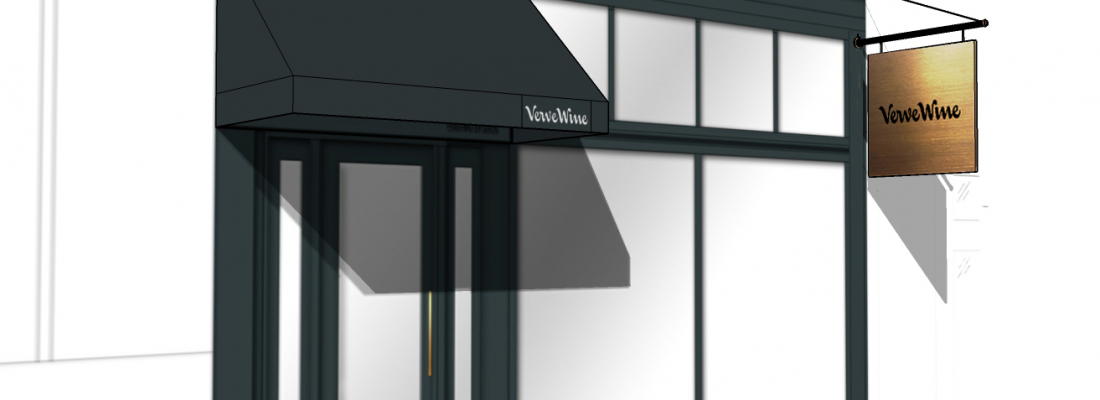
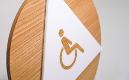
Brass signs are true Insta bait—but designing one can be tricky. Not to worry: follow these 5 rules and you’re on your way to mastering that chic, retro look.
When it comes to brass signage, less is more. A brass sign is an investment, and making the right design decisions will help you showcase your sign in the best way possible.
Header image: Handel Architects

1. Stick to classic fonts
Serif typefaces, block text, and thicker script typefaces work well. For a more modern look, choose a font that’s a twist on a classic.
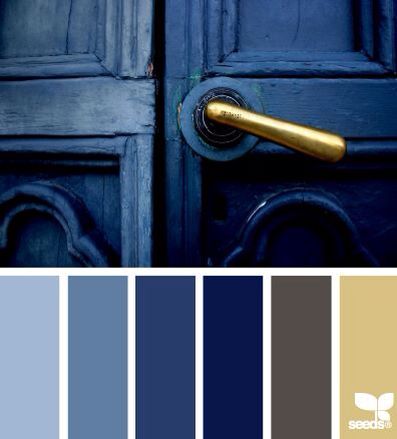
Image: Design Seeds
2. Pair with neutral colors
Brass is best used as an decorative accent, and pairing it with neutral colors that will help it pop. Too much color or shine—and it can start getting gaudy.
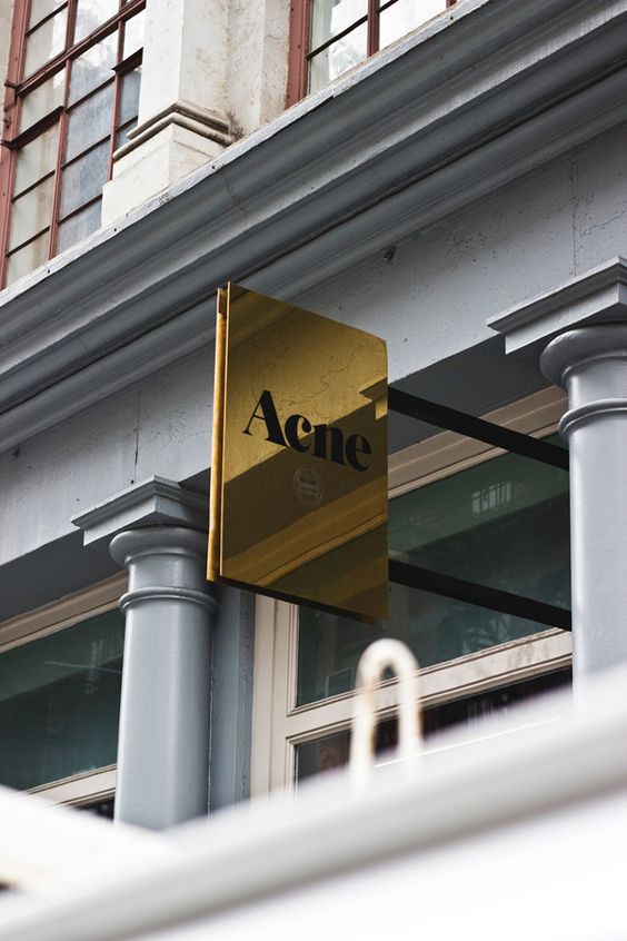
Image: UltraLinx
3. Notice the lighting
The way light hits your sign can be stunning—or make it hard to read. Take note of the lighting in your space, and how you want the sign to look from your typical viewing distance.
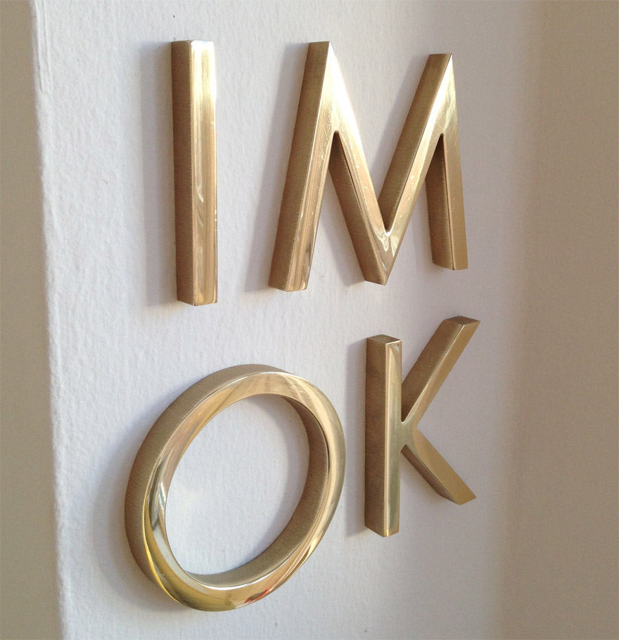
Source: Matthaeus Krenn
4. Know your finishes
Unlike gold, brass is actually an alloy of copper and zinc. It can take on a variety looks based on the alloy mix and surface treatment, such as oxidation, brushing or polishing.

Project: Verve Wine
5. Ask about weight limits
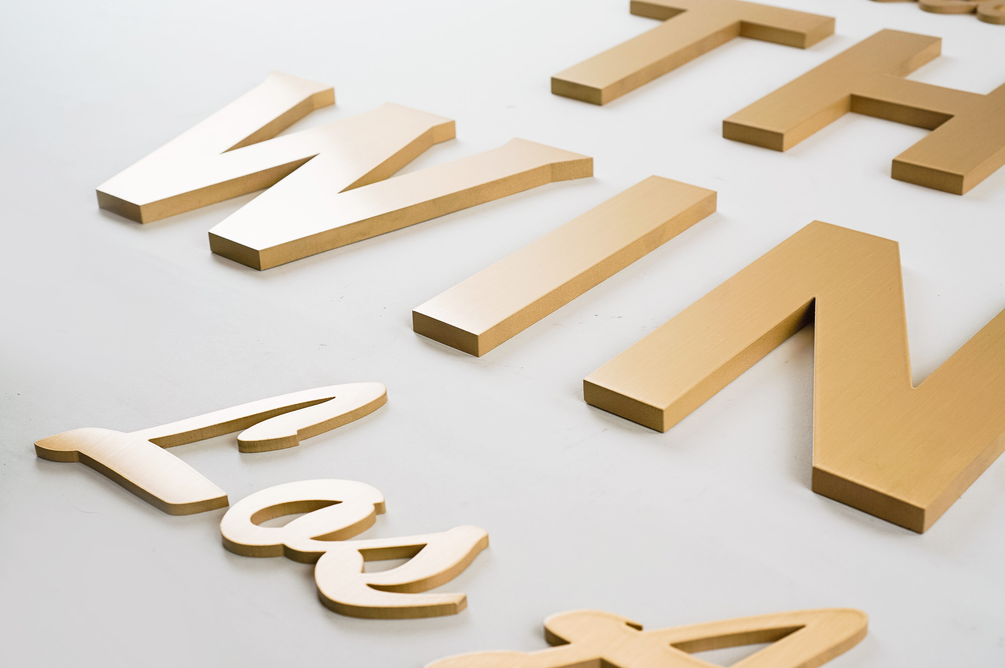
Solid brass signs are heavy, which is why they are usually single letters, or attached to masonry. We recommend brass alternatives for single, large pieces. If you’re on a trade show circuit—that solution might be for you.
Need inspiration?
Check out Brass signage: Tips and inspiration for a new take on an old classic
