We’ll show you where you need to stick to ADA standards—and where you can get creative.
For as many regulations as there are, you’d be surprised at how much flexibility you get when it comes to sign illustrations. But before we get there, let’s go over the basics.
What are images on signs for?
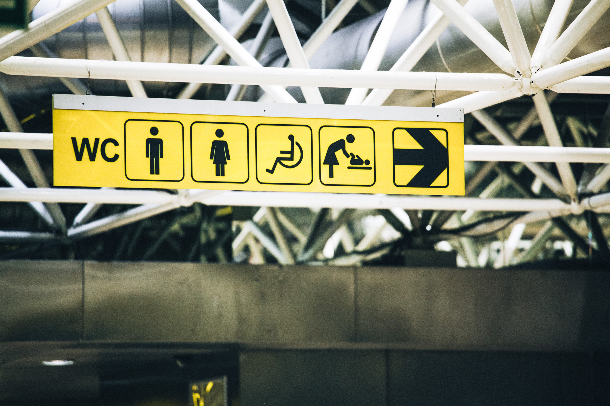
European pictograms
We may call them icons, drawings, or symbols, but the term that’s used in the signage world is pictogram. A pictogram is a quickly comprehensible image that helps someone navigate a space.
Pictograms often resemble a physical object, and don’t rely on words to convey their meaning. They are always visually simple so that they remain recognizable, since factors such as physical placement, color, and lighting conditions of the sign can vary.
When it comes to ADA signage, there are 3 pictogram categories to know.
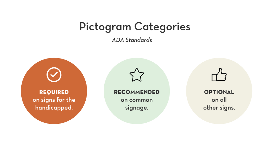
- Required pictograms: There’s only four pictograms in this category, and they are those that serve the disabled.
- Recommended pictograms: Pictograms are recommended for signs that identify a room.
- Optional pictograms: These common pictograms are actually not part of ADA standards, but they may be required according to your industry, building, or state that you operate in.
1. Pictograms are required on signs that assist the disabled.
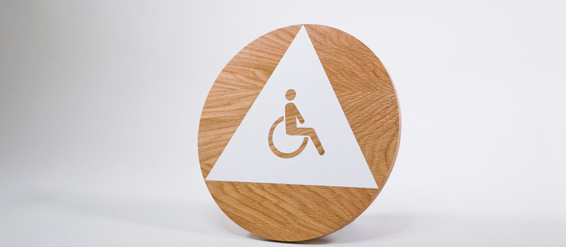
Any sign that provides direction to accessible spaces requires pictograms. In most cases, that just means that signs for your wheelchair accessible restrooms and parking spaces should have the ISA icon below.
| Image | Name | This should be used on all signs that identify or point to… |
Download |
|---|---|---|---|
| International Symbol of Accessibility | …anything that is wheelchair accessible. This includes restrooms, parking spaces, vehicles, buttons, stations, and routes. | JPG | EPS | |
| International Symbol of TTY | …a public teletypewriter (text telephone), which allow the hearing impaired to type messages back and forth instead of talking. | JPG | EPS | |
| Volume Control Telephone | …an amplified telephone, which allows the hearing impaired have clearer telephone conversations. | JPG | EPS | |
| Assistive Listening Systems | …an assistive listening system, which are devices that allow the hearing impaired to amplify sounds directly into the ear. | JPG | EPS |
DID YOU KNOW?
Signs that serve the disabled are recognized worldwide.

Although ADA standards only apply nationwide, these four pictograms are recognized all around the world. This set is part of a larger library created by The International Organization for Standardization (ISO), a group composed of representatives from various national standards organizations. It was founded in 1947, and is headquartered in Geneva, Switzerland.
Can you use an alternate symbols for these? Yes, but only if they result in “substantially equivalent or greater accessibility and usability.” While flexibility and innovation are encouraged, you must show proof that this symbol is effective in the event of a legal challenge.
We recommend sticking to these exact symbols to be on the safe side.
2. Pictograms are recommended on room signs (mostly restrooms)
ADA standards recommend pictograms on any sign that identifies a permanent room, as it’s always helpful to be able to quickly identify your conference room or break room. This is especially helpful if many of those using the space are non-English speakers.
But realistically speaking, the only room you need to worry about is the restroom—it’s the only one that people expect to see a pictogram for.
| Name | Traditional | + wheelchair accessible | Modern |
|---|---|---|---|
| Unisex Restroom | JPG | EPS |
JPG | EPS |
JPG | EPS |
| Men’s Restroom | JPG | EPS |
JPG | EPS |
JPG | EPS |
| Women’s Restroom | JPG | EPS |
JPG | EPS |
JPG | EPS |
| Family Restroom | JPG | EPS |
JPG | EPS |
JPG | EPS |
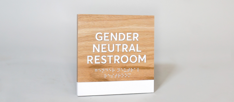
| Gender Neutral / All Gender | coming soon | coming soon | coming soon |
This is where you can get creative—but do keep in mind that any clever illustrations should still be clear enough to guide the way.
As an example, we added a set of restroom icons here in a more modern style. (Honestly, we can’t quite figure out why standard pictograms for restrooms feature a family of quarterbacks).
If you’re in California, note that there’s additional regulations on restroom signage. We’ll have more on that later.
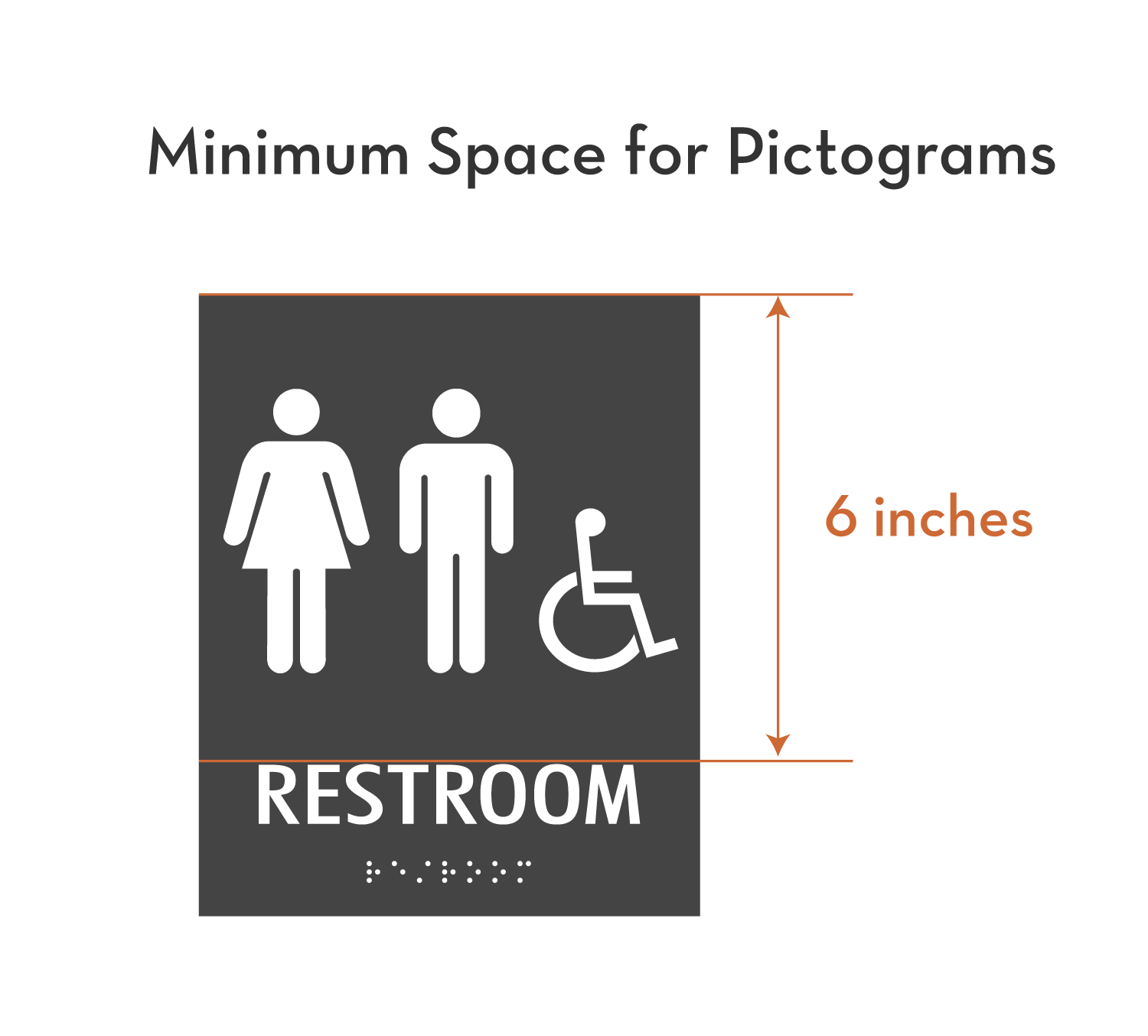
Note: Check that you sign follows minimum spacing rules.
These only apply to pictograms that are required or recommended. These pictograms must be in a space that is at least 6” high. Funny enough, there’s no specific rule on the size of the pictogram itself.
3. Pictograms are optional on all other signs.
You may be surprised that all the pictograms below are not part of ADA standards. However, these pictograms may be required for your industry, building, or state. We recommend checking if you have annual inspections of any sort.
Because these pictograms are not part of ADA standards, they don’t require text to go with it, nor do they need to follow size or spacing rules of any sort.
The Lazy Designer’s Guide to ADA Signage
We read 279 pages of the ADA Standards for Accessible Design so you don’t have to. If you found this article helpful, check out the other articles in this guide.


