Great work! You’re now on your last and final step – displaying your ADA signage. Follow these illustrations to avoid making any mistakes.
Placement of ADA wall signs
Your wall sign must be displayed on the latch side of the door in a space that is at least 18″ wide (in the case of double doors, it should be on the right). Have less than 18″ of space for the sign? It should be on the adjacent wall—not on the other side of the door.
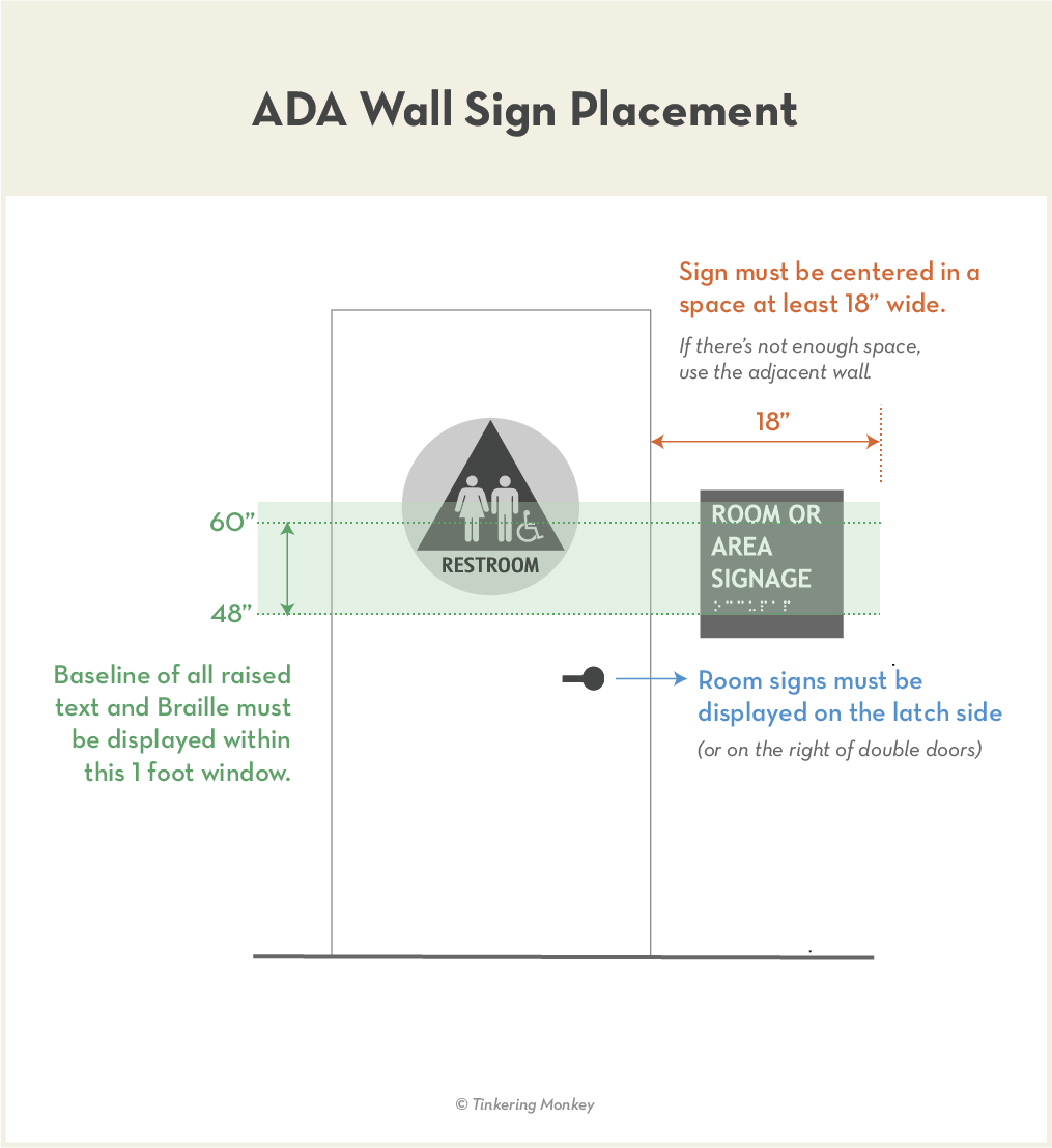
In addition, the sign text (both letters and Braille) must be shown within the window shown. The baseline of the last line of Braille must be at least 4 feet from the ground, and the text above should not exceed 5 feet.
WHY THESE STANDARDS?
- For the disabled, doorways are quicker to find than signs, so having the signs located in a consistent place across all buildings can greatly help them identify a room.
- For those who read by touch, providing ample space around a sign avoids confusion with other elements.
- Requiring text to be displayed within the one foot window shown allows signs to be easily read for both the disabled and non-disabled.
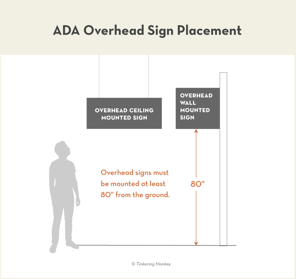
Overhead Sign Display
Regardless of how your sign is mounted, and sign that is displayed overhead must be at least 80″ from the floor. The average height for an adult male over age 20 in the United States is 5′ 9″, so that leaves just a little less than a foot above his head.
The Lazy Designer’s Guide to ADA Signage
We read 279 pages of the ADA Standards for Accessible Design so you don’t have to. If you found this article helpful, check out the other articles in this guide.

