Looking for the ultimate guide to designing menus that change at the drop of a hat? You’ve come to the right place.
Whether you’re trying to keep up with trends, need to update prices, or showcase seasonal ingredients, one thing’s for sure—a flexible menu is critical to your bottom line. The right kind of menu design can also brighten up your business, like a pop of color would for your decor.
But a changeable sign system is only a success if it’s easy to implement quickly. Read on to learn about different techniques, and the advantages and pitfalls of each.
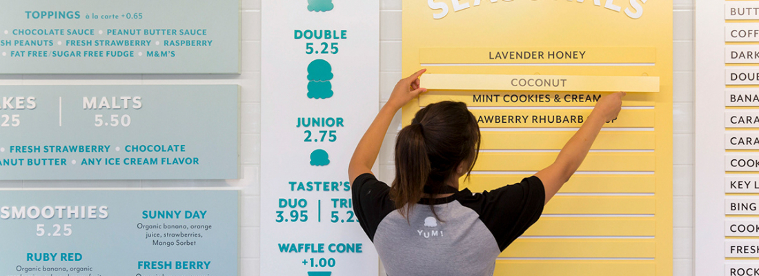
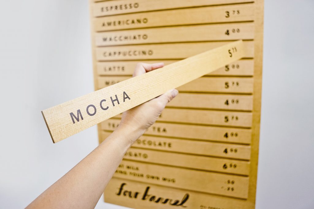
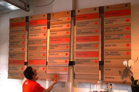
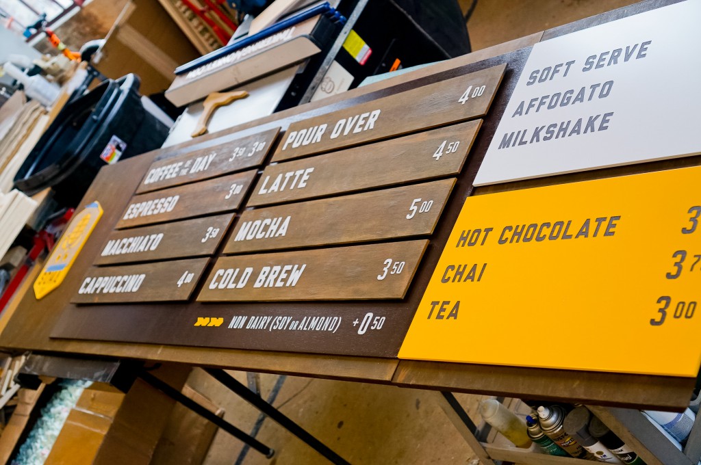
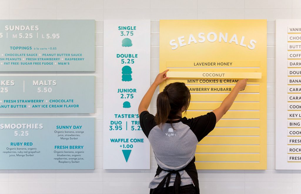
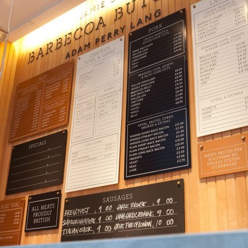
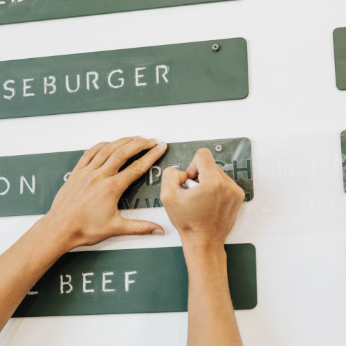
Slats: Perfect for rotating menu items
For ultimate flexibility, consider a menu system that uses individual slats or placards so you can change out items as you need. The downside? Turnaround may not be quick if you’re getting the menu items produced by a vendor, and depending on the design, you may be tied to text length or a certain number of line items.
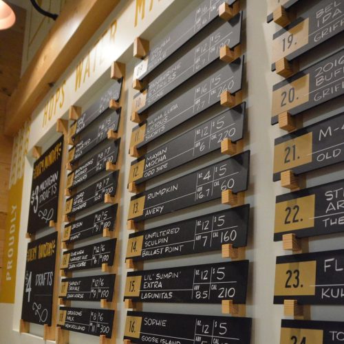
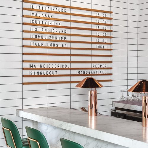
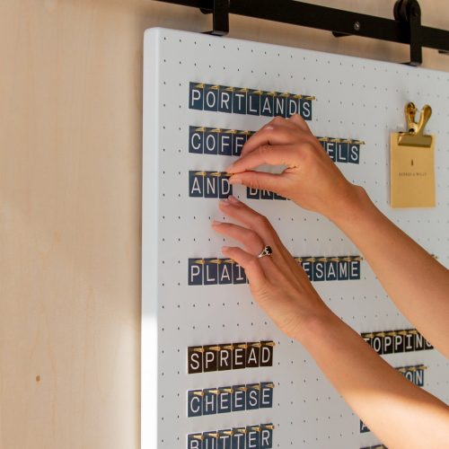
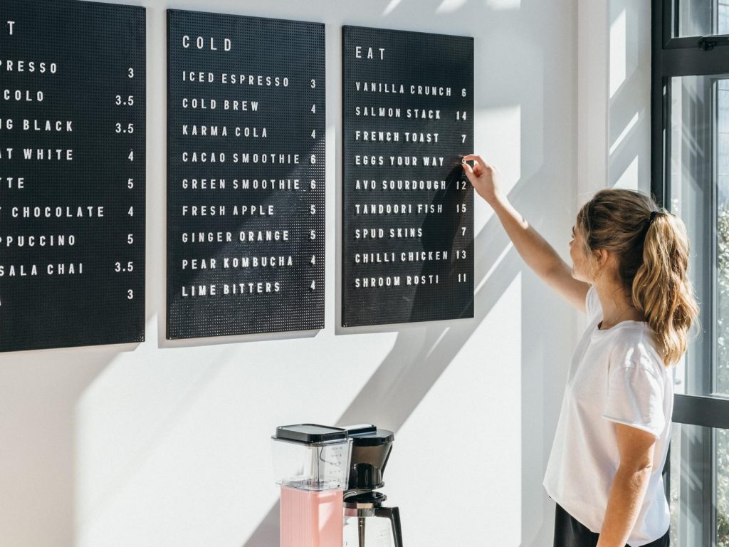
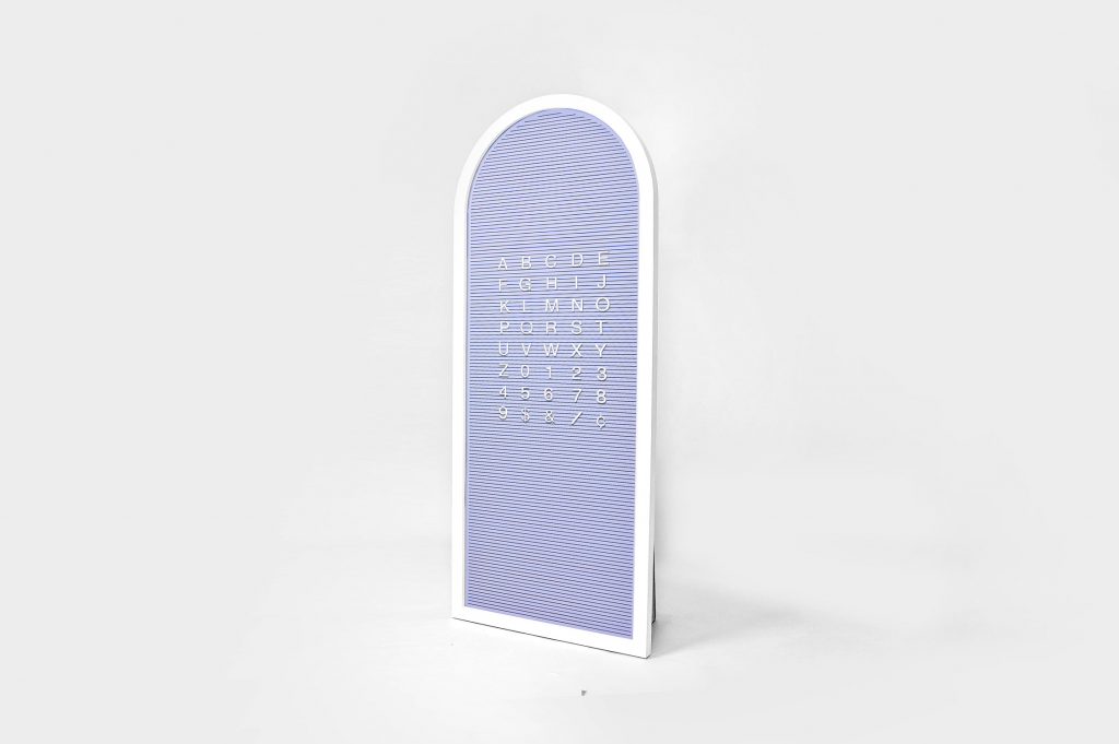
Letterboards and pegboards: For a retro look
Need daily menu changes? This is a good way to go. Keep in mind that custom fonts are rarely available; you or your sign vendor will likely need to source an existing letter set, which generally uses standard fonts. Be sure to consider a source that makes it easy to purchase replacements, as letters may mysteriously go missing over time. Pro tip: Consider viewing distance and letter size, as these type of signs may be difficult to read.
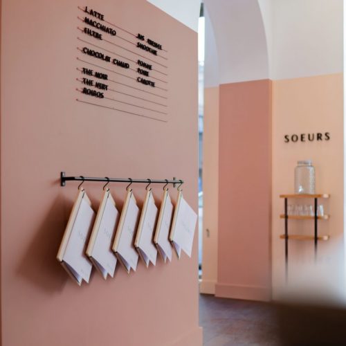
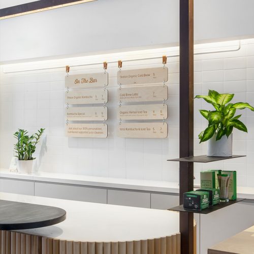
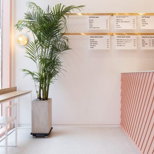
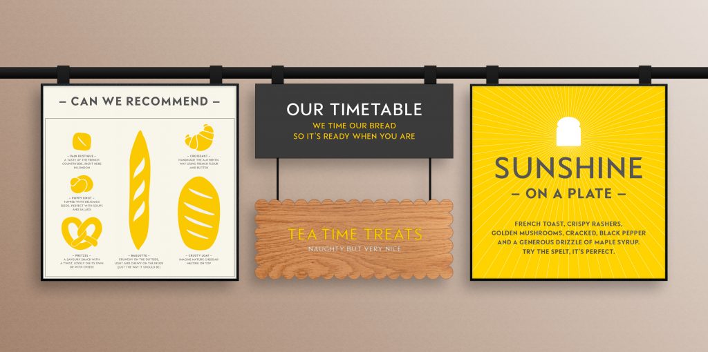
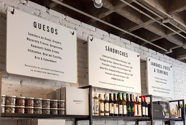
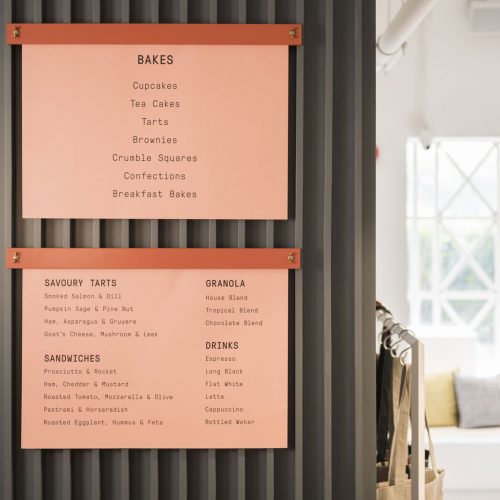
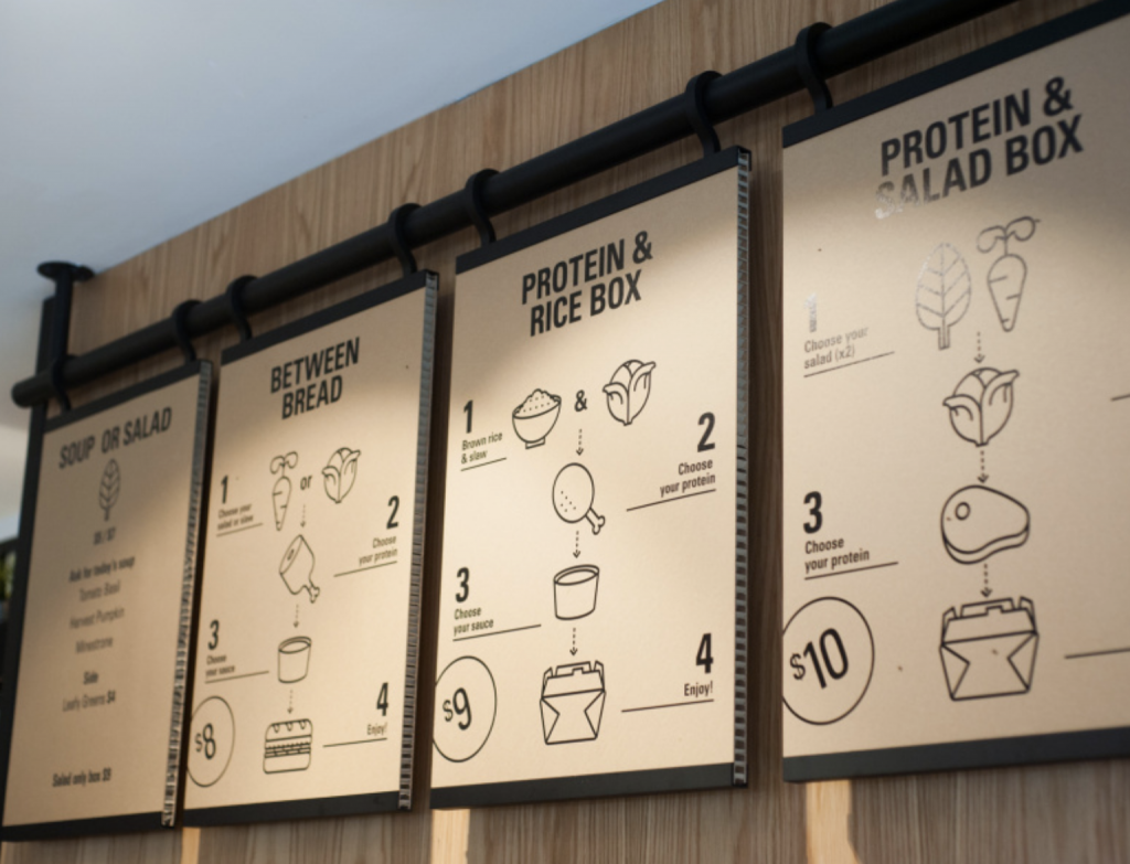
Hanging Panels: Great for seasonal menus
Menus that hang on pegs or rails are ideal for menus that change monthly, quarterly, or seasonally. Though not as flexible as the earlier examples, they provide more room for creative details, like adding menu item photos, or decorative graphics to celebrate an event or holiday. However, implementing menu changes may require some turnaround time; we recommend asking your print shop or sign vendor how long it will take to create replacement panels.
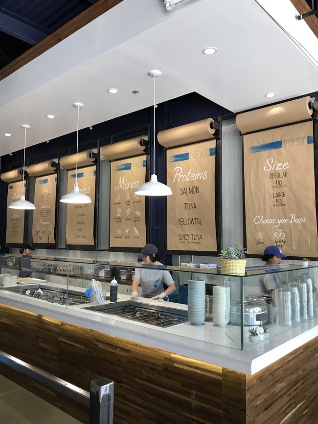
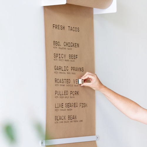
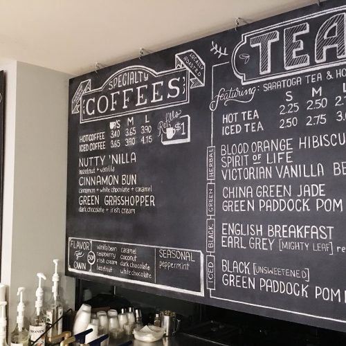
Handwritten menus: For a friendly neighborhood look
Know a chalk artist or someone with great penmanship? Handwritten menus are a great way to create an inviting feel for your space. If the handwritten text proves to be difficult to read, consider using stamps or stencils.
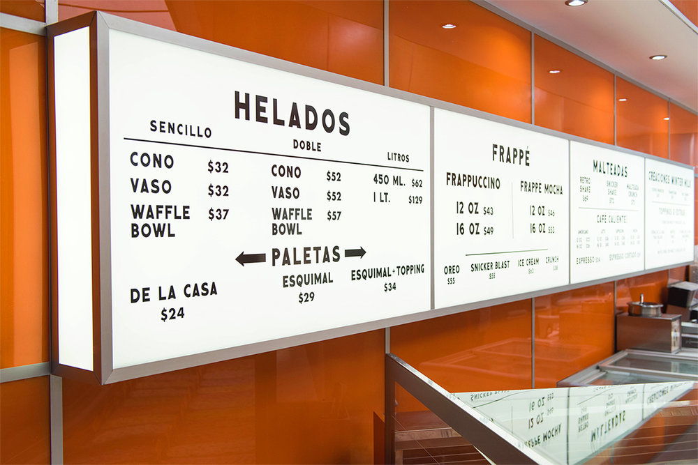
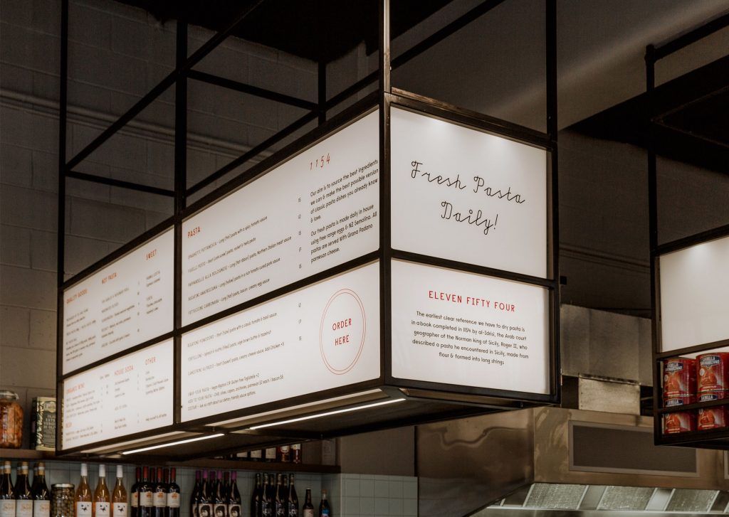
Lightboxes: The original counter menu
Lightbox menus have been gracing diner and fast food counters for decades. These days, they’re making a comeback by ditching the food photography and opting for simple lettering instead. These signs are great for dim settings and retro-inspired interiors, though they may require a professional installer for menu updates.
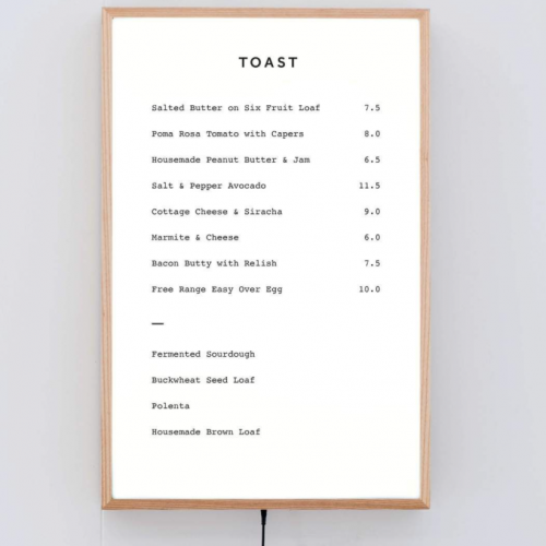
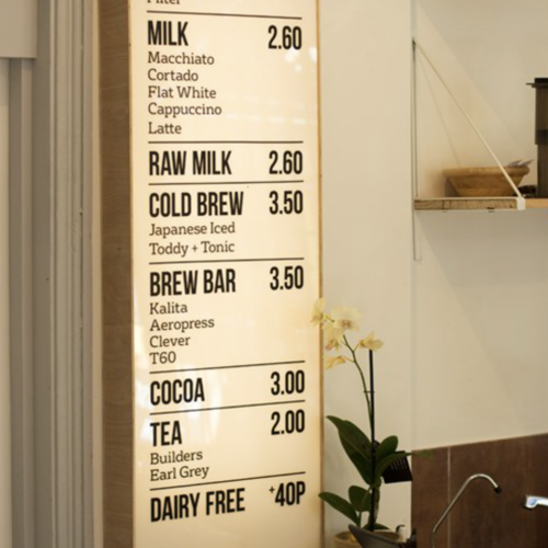
Bottom line: The perfect menu design is one that’s created just for you.
While there are a multitude of options available, a menu that’s custom tailored to your needs will be worth every penny of your investment. Make sure the menu is flexible to work with your changing business needs, easily updatable by your staff, and most of all—will delight customers and keep them coming back for more.
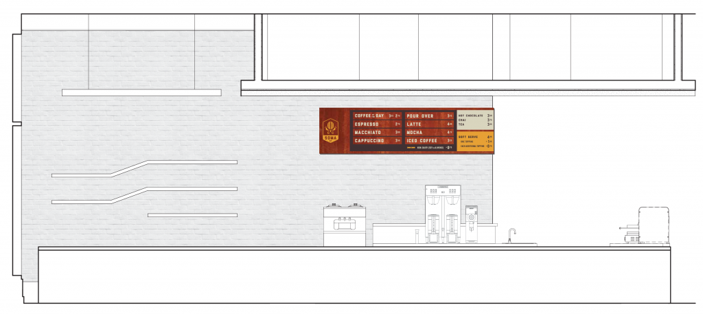
Questions to ask when designing a changeable menu:
- Content: How often will your menu be changing? What parts of your menu will be changing? Will prices need to be updated? Do you need photos or graphics on your menu?
- Execution: How easily do you need the changeable parts to be? Do you have staff on site to manage menu changes? If you’re working with a vendor or artist to produce parts of the menu, how quick do you need the turnaround to be?
- Design: What is the typical viewing distance, and how large does the text need to be? What colors and materials best work for your space? What visual cues can you give customers to get them excited about future visits?
Need more ideas?
We’ve helped create signage for hundreds of restaurants, cafes, and bars—whether there’s one location or one hundred. Check out some of the signs we’ve made for the food industry »
