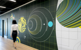
Say goodbye to yawn-worthy corporate walls and hello to an era of Instagram trending statement walls. This list will show you how to give your mission statement, company quotes, or core values a fresh new look.
We’ve created signs for plenty of walls with strong branding—that don’t include a logo at all. Here are 26 of our favorites from our own archives and from around the web.
A bold look for a bold statement.
Bold statements often work best in a style that’s loud and clear. These walls make a stunning first impression.
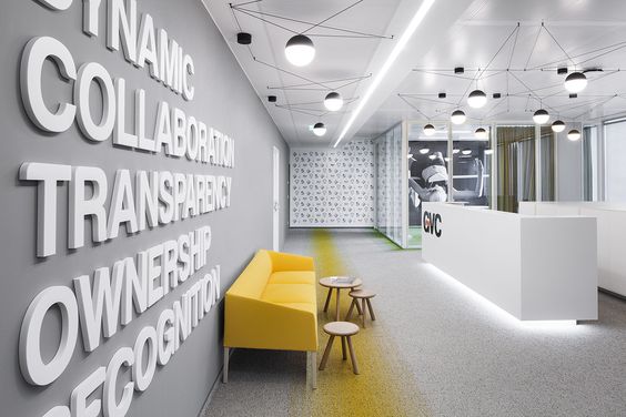
The bold white text ties together this office’s monochromatic look, while the pop of yellow invites the guest inside.
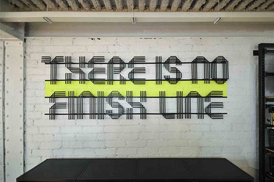
We’re huge fans of signs that visualize the message. This sign at a Nike store illustrates the idea of no single finish line—by creating the text from multiple lines.
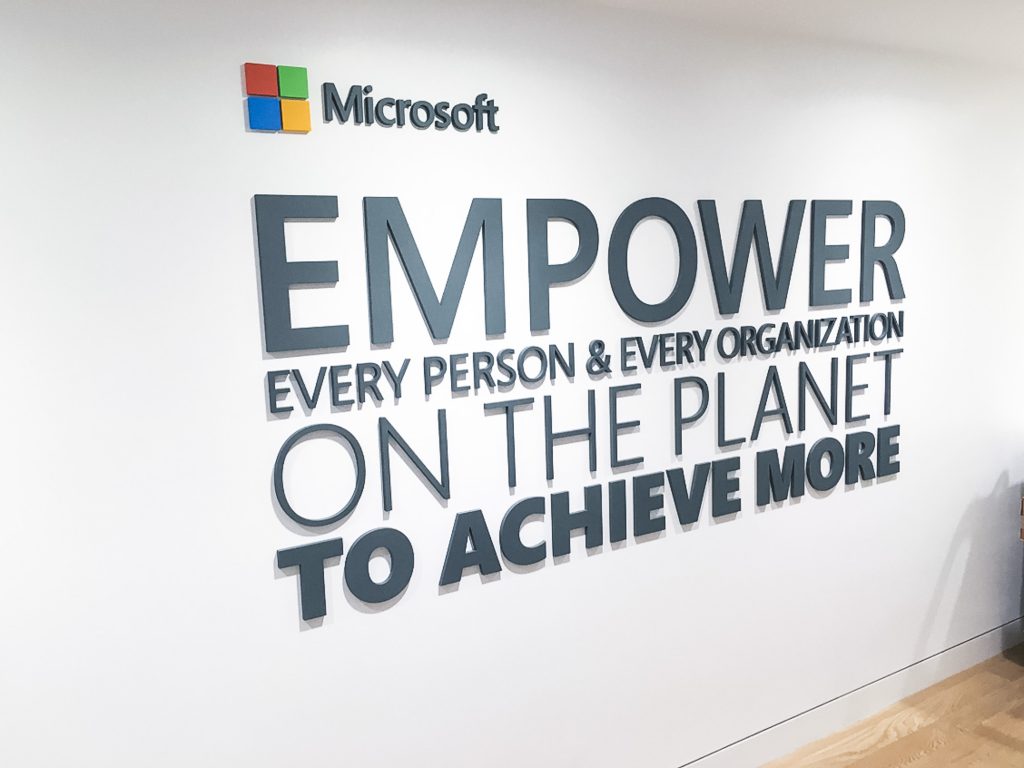
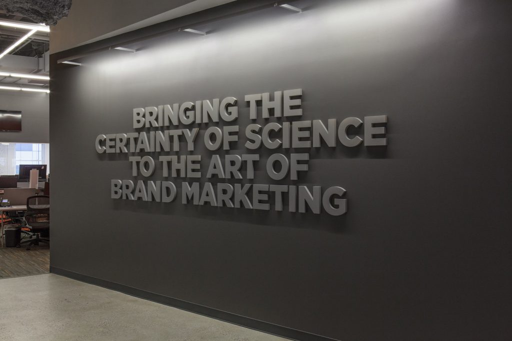
Take Microsoft’s cue and break your company’s message into separate parts with different styling. This is a great way to emphasize the most important parts of the text.

Corporate messages can fit in small spaces, too. We made this sign to perfectly fit this corner of a board room at the Cell Design Labs in Emeryville, California. See project »
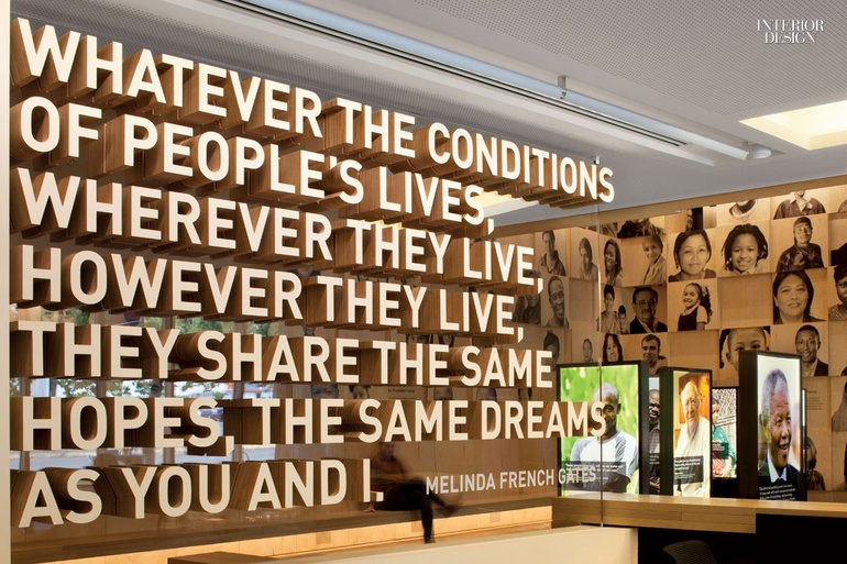
This quote is displayed on a clear acrylic room divider, which gives it a floating effect (and an interesting look on the other side).
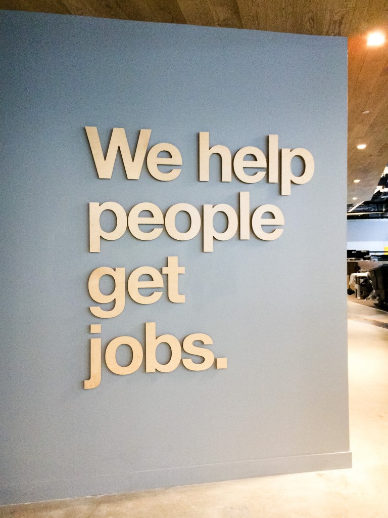
This light wood sign we made for Indeed sums up everything they do in just 5 simple, bold words. See project »
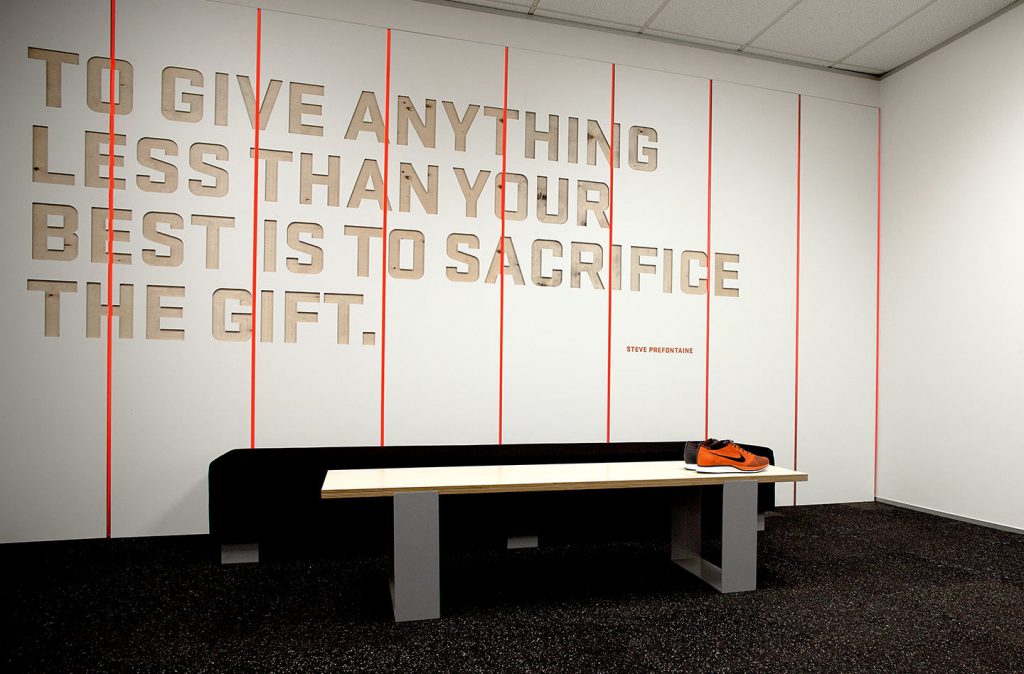
If you space has a strong theme, consider matching your signage to the environment. These engraved panels at a Nike store gives the space a locker room feel.
Handwritten text provides a human touch.
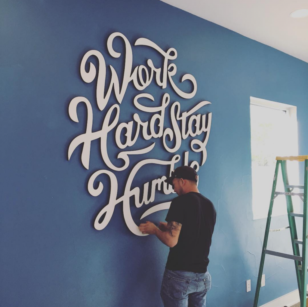
Great on a wall—and on Instagram. This sign we made for WebTegrity not only echoes the hardworking attitude of the company, but is one of our most popular Instagram posts to date.
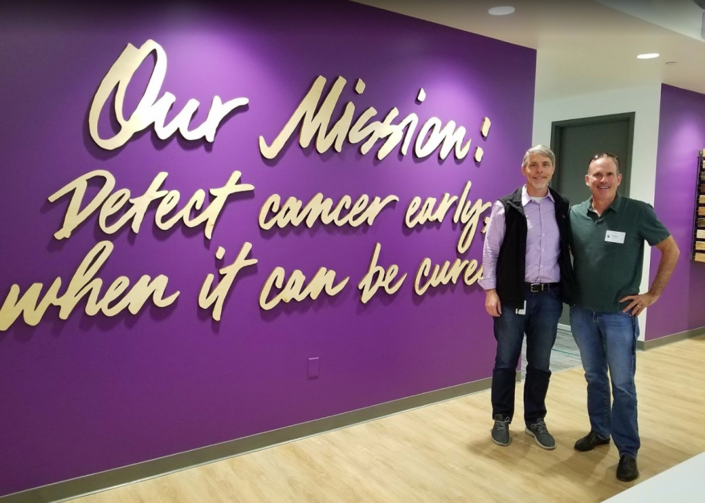
This wood mission statement we made for the GRAIL headquarters in Menlo Park, CA was installed on a vibrant purple wall, giving the common area an uplifting feel.
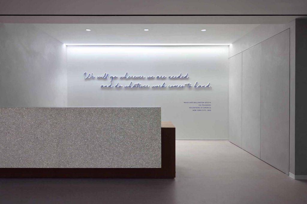
Strategic lightening allows this quote at the lobby of Volunteers of America office in New York to glow, giving the lobby an ethereal feel.
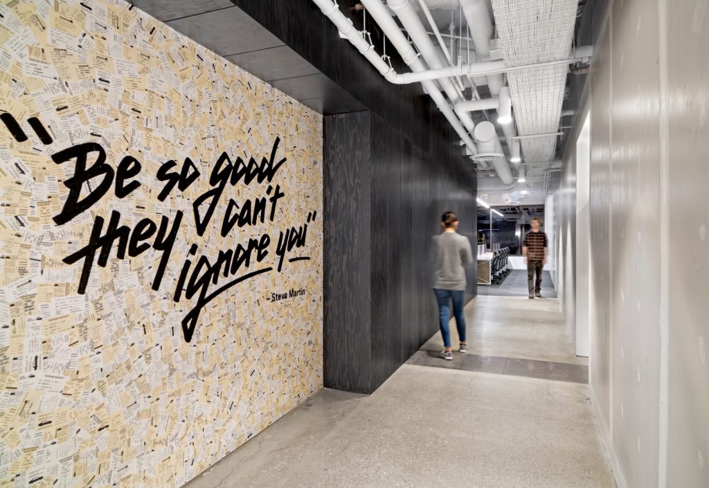
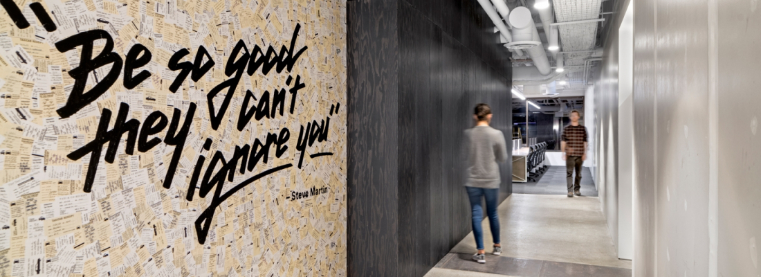
As a sly dig at the taxi industry that Uber is turning upside down and as a creative means to bespoke wallcoverings, O+A filled out hundreds of taxi receipts by hand, scrawling large quotes from Steve Martin and Stephen Hawking, and pasted them on two walls outside the restrooms. —Contract Design
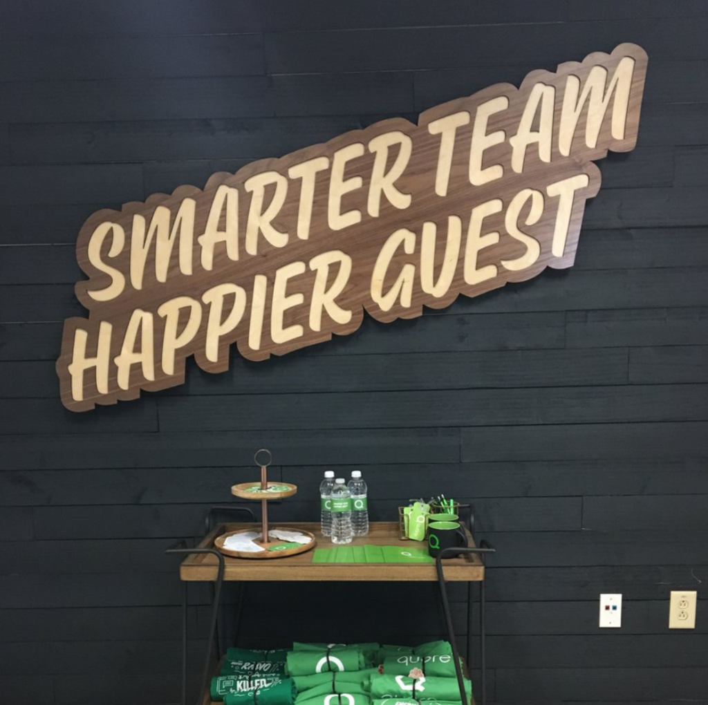
We love making signs for internal teams, like this one for Quore, a company that creates software for hotel operations.
Use light to illuminate and inspire.
Illuminated signage was created to increase foot traffic for retailers. Nowadays, you’ll find them in commercial interiors as a way to showcase an inspiring message.
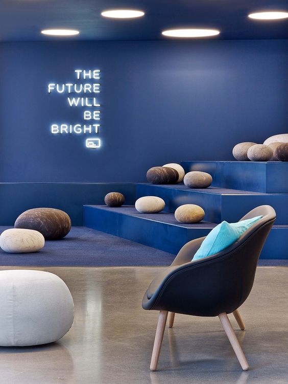
Fullscreen is a global leader in social entertainment, and this “the future will be bright” neon sign couldn’t be more perfect for a creative group.
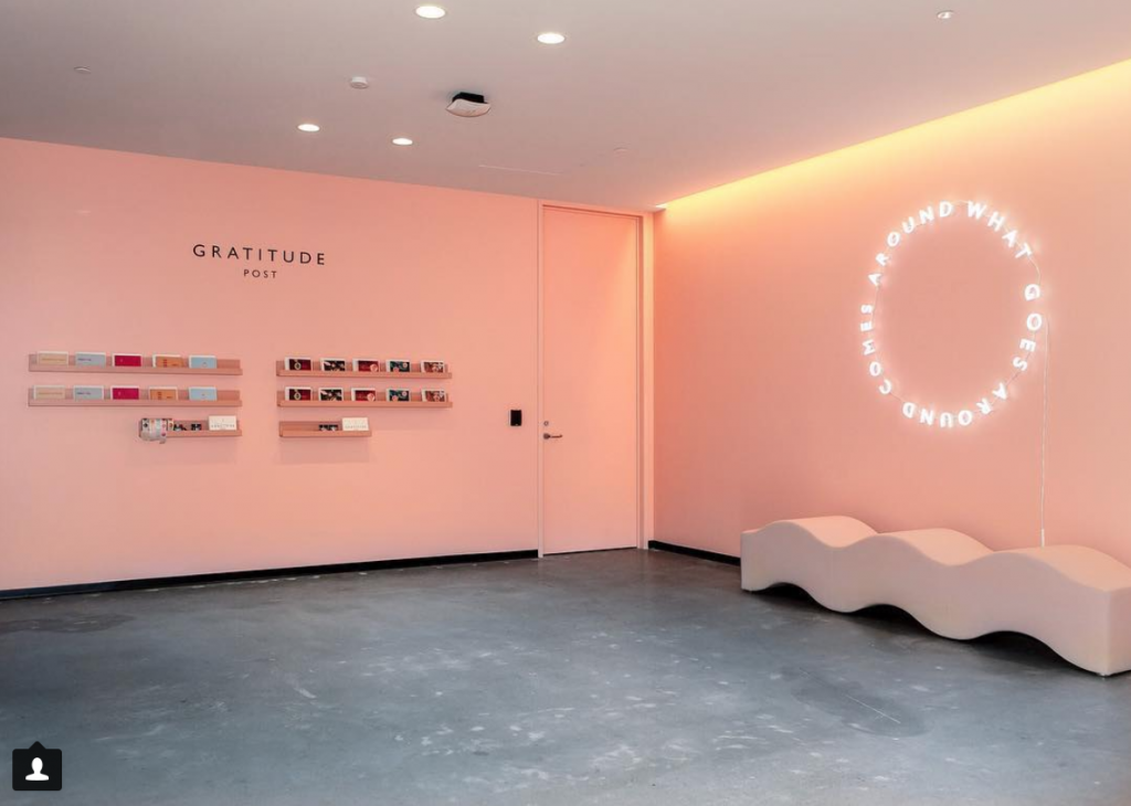
We made this custom “What Goes Around Comes Around” neon-style sign for a internal gratitude postcard shop at one of the Dropbox offices, inviting employees to say thanks and practice daily gratitude.
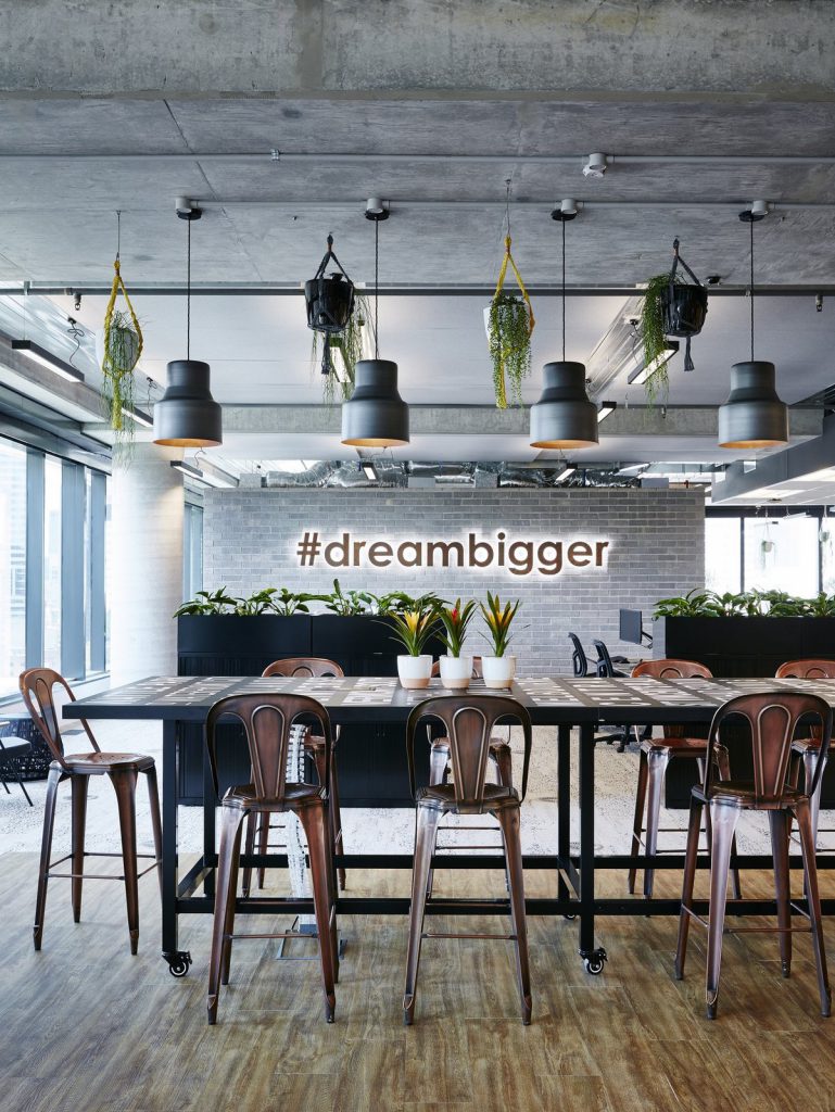
Can your organization be summed up in a single hashtag? This #dreambigger illuminated sign works well in a minimalist setting at Porter Davis, a house building company in Australia. This sign doubles as a photo backdrop for groups.
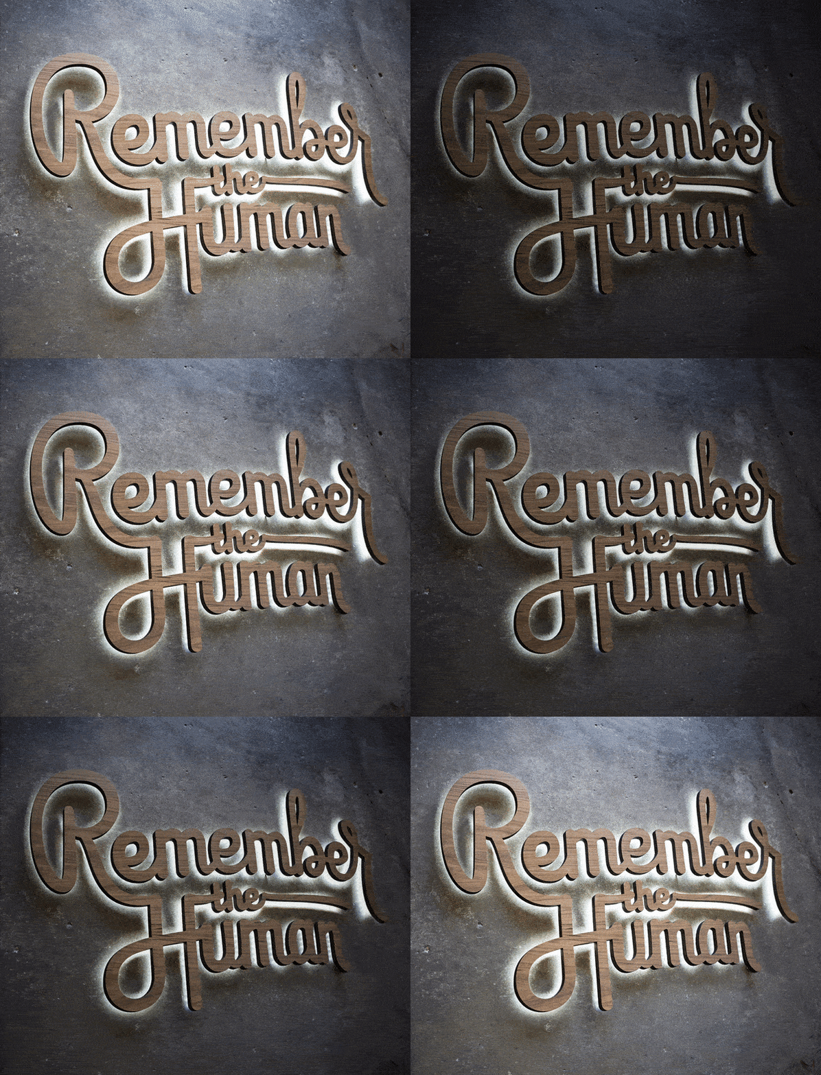
Ask your team if anyone has created any artwork on the side. Reddit was inspired by one of their employee’s pencil sketches, and asked us to bring it to life. See project »
Use color-on-color signage to create a 3D wall effect.
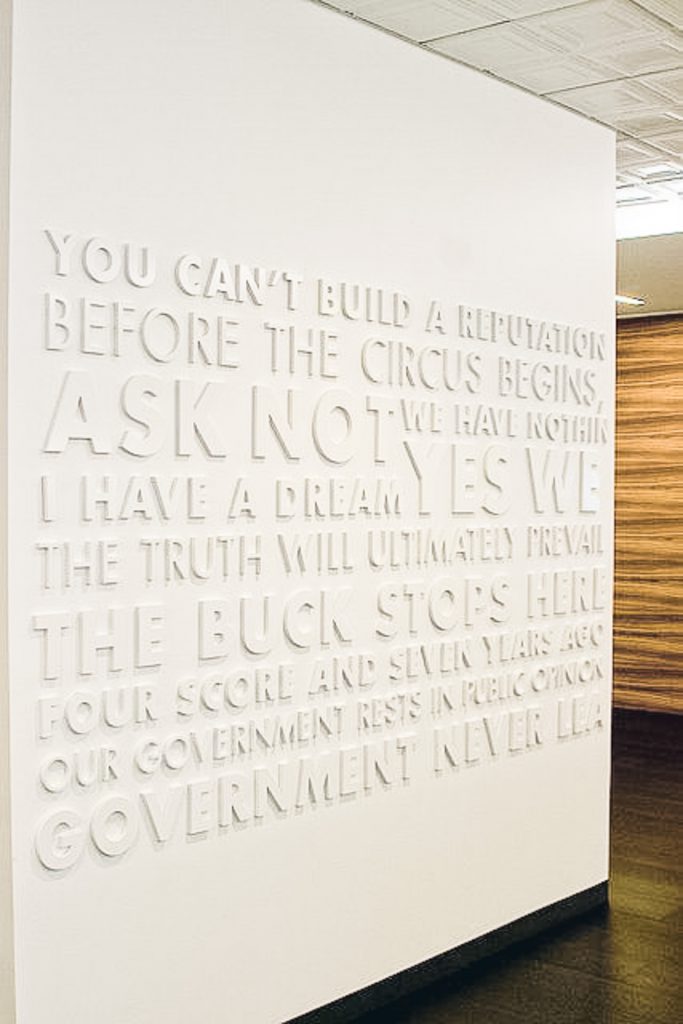
Tone-on-tone (or color-on-color) signage incorporates signage that perfectly matches the wall color. This allows the message to have a subtle, background effect—while still giving it a tactile look. The only catch here is that you’ll need the right lighting setup to capture the shadows correctly.
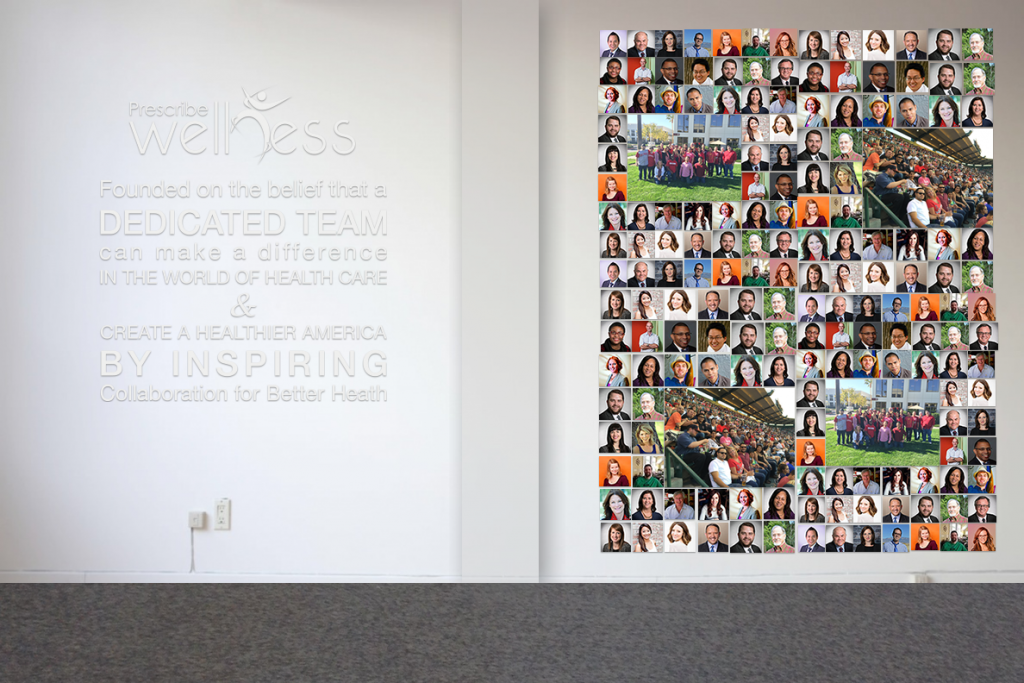
This is a mockup of a sign we made for Prescribe Wellness, a company creating technology for local pharmacists. While this isn’t exactly color-on-color, the metallic silver text was low contrast on the white wall, allowing their photos to stand out.
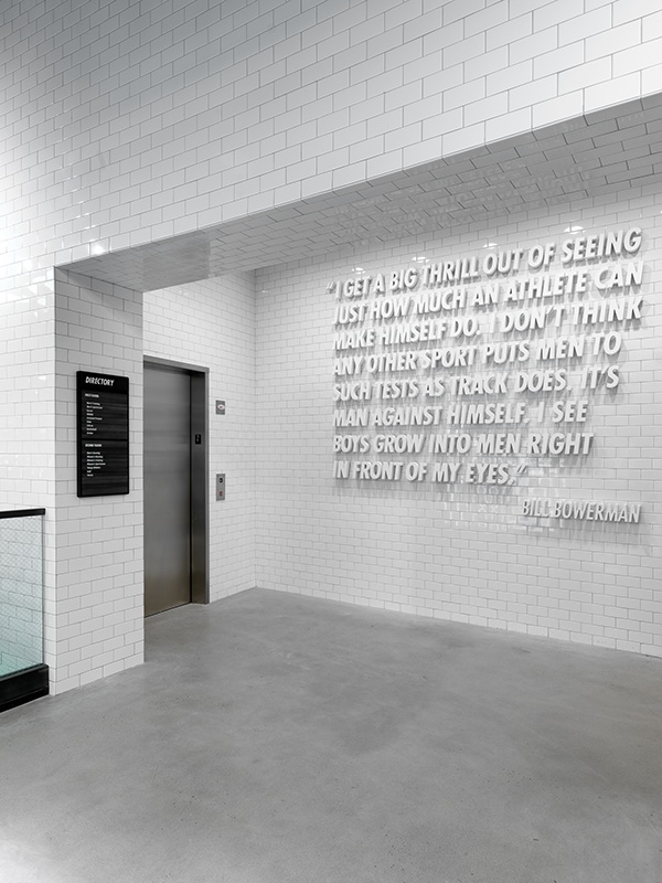
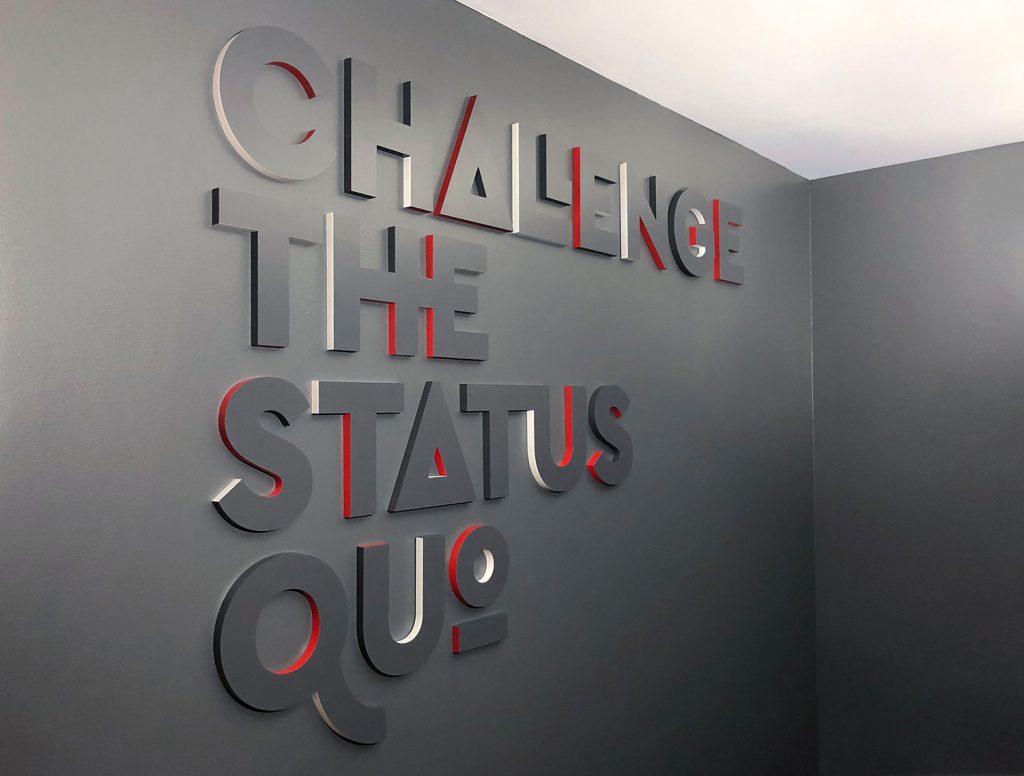
We made this sign for Envoy under the direction of designer Amy Devereux. The design helps invoke the idea of doing things differently by using the brand colors on the sides, instead of the face. See project »
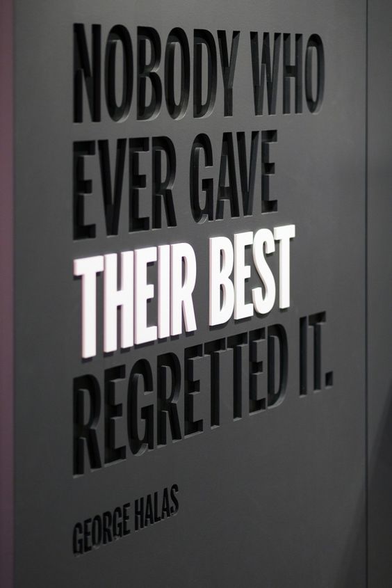
Gensler used different surface levels and color contrasts to make “their best” stand out in this powerful quote at a Wilson Sporting Goods location.
Make it interactive.
Some of our customers have taken it a step further with signs that you can interact with.
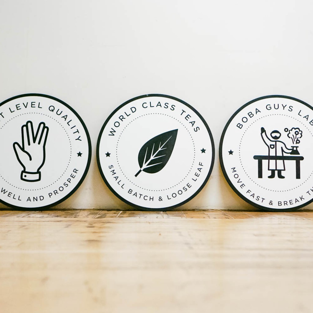
Boba Guys had their values incorporated into three beautifully designed emblems, proudly displayed at each of their locations. See project »
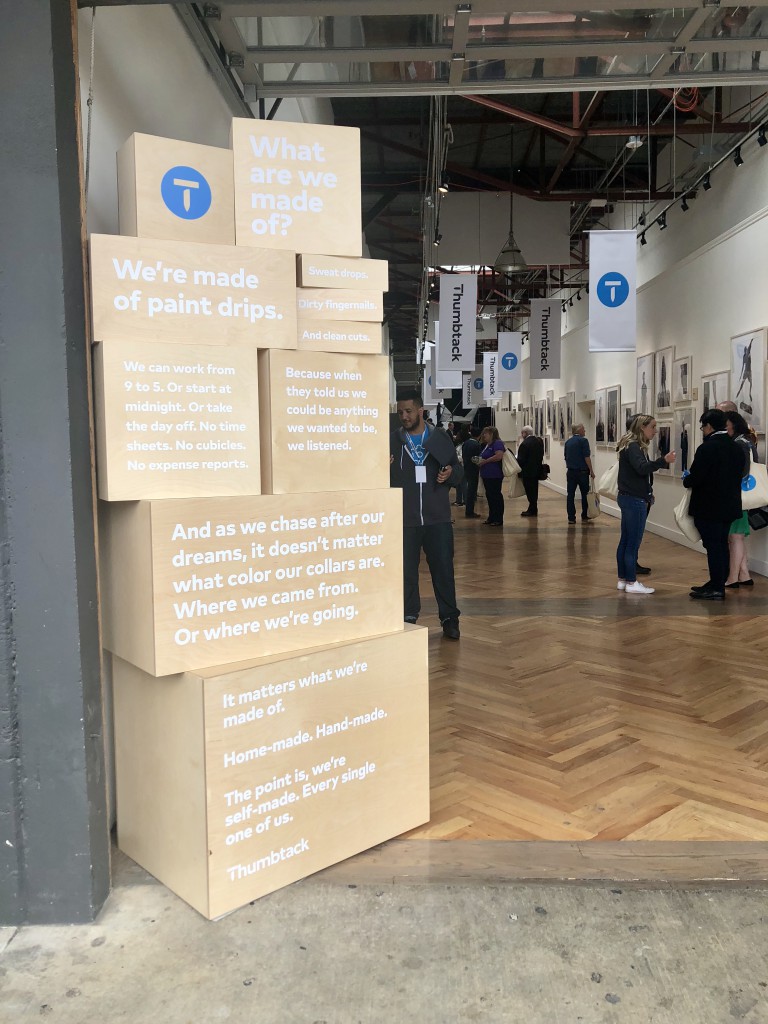
Thumbtack came to us earlier this with a challenge: create a stack of boxes with their manifesto around being self-made. This was displayed at their brand launch event (practically speaking, to cover up an unnecessary ATM machine at their venue), and later as permanent installation in the office. See project »
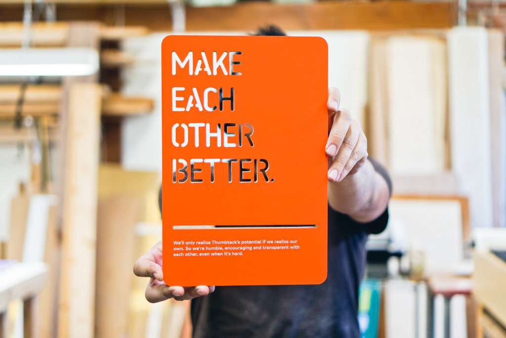
Instead of adding their core values to a wall, Thumbtack turned to us to make a few sets of cards that can be moved around the office and used as needed. See project »
Feeling inspired? Try these five tips.
Brainstorm how your organization’s message would look on a wall. Here are a few tips from the example above:
1. Have a bold statement?
Try incorporating a bold look into your wall using a strong typeface, contrasting colors.
2. Have a great quote or a sentimental message?
Consider using handwritten text or script for human touch.
3. Have an inspirational statement?
Consider an illuminated sign.
4. Want your message to fully incorporate into the space?
Consider color-on-color signage for a subtle look—while making it tactile.
5. Looking to have fun with your message?
Make it interactive by making it not permanent, and interactive pieces.
