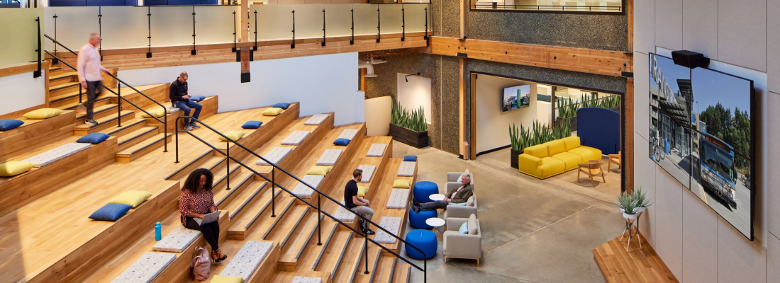
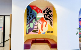
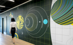
Think high school bleachers, but all grown up.
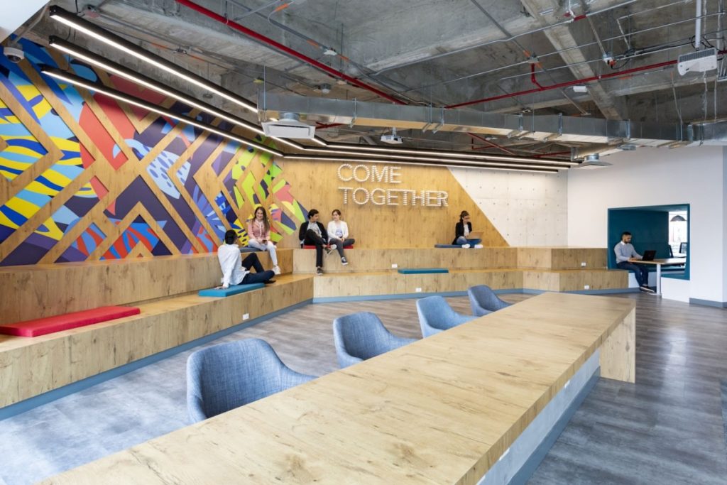
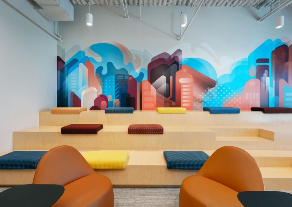
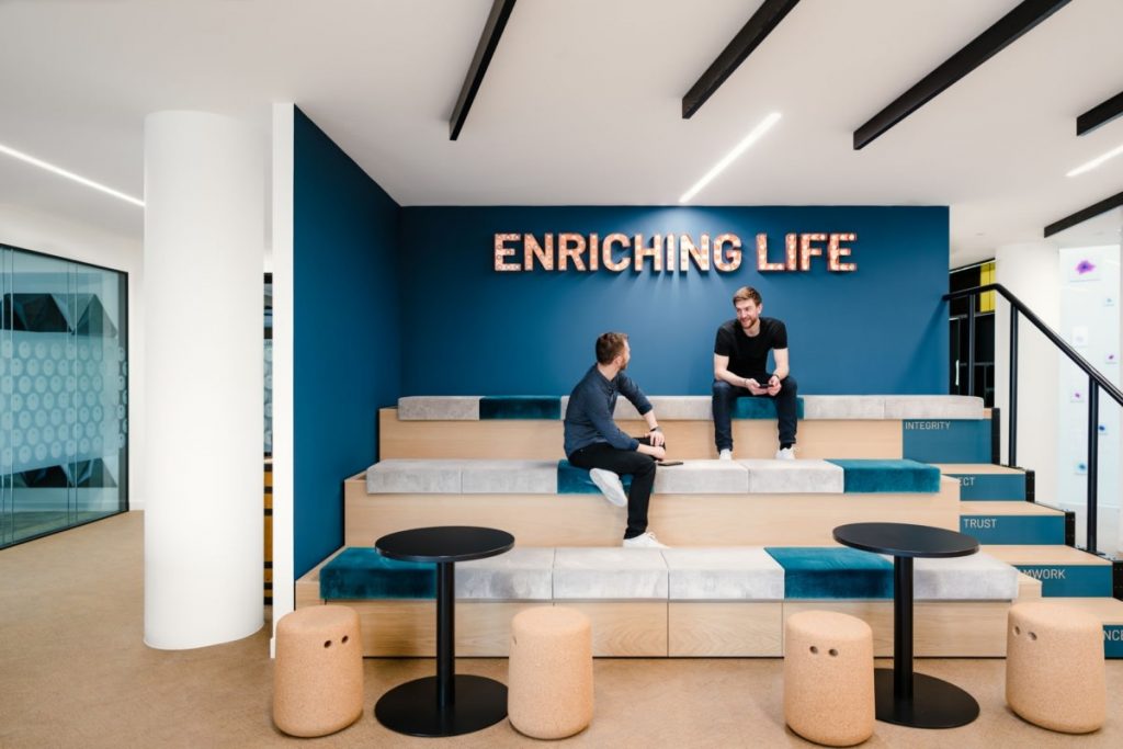
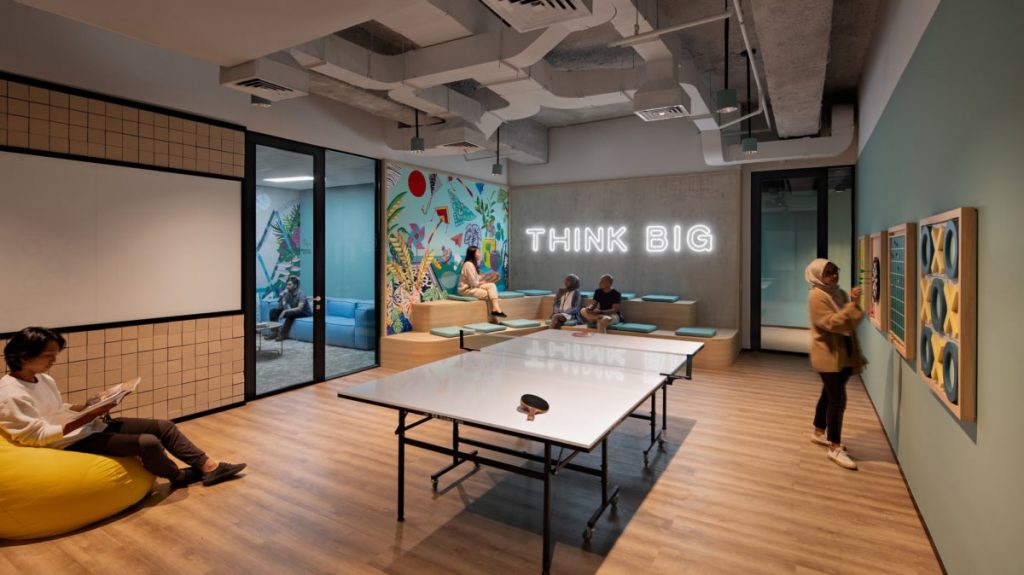
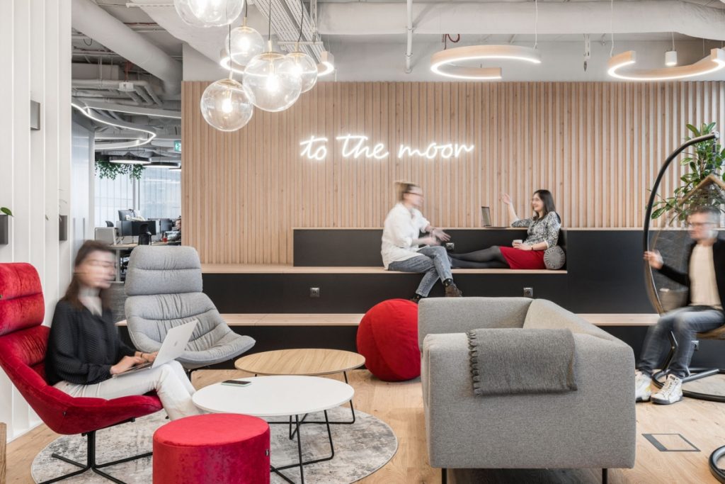
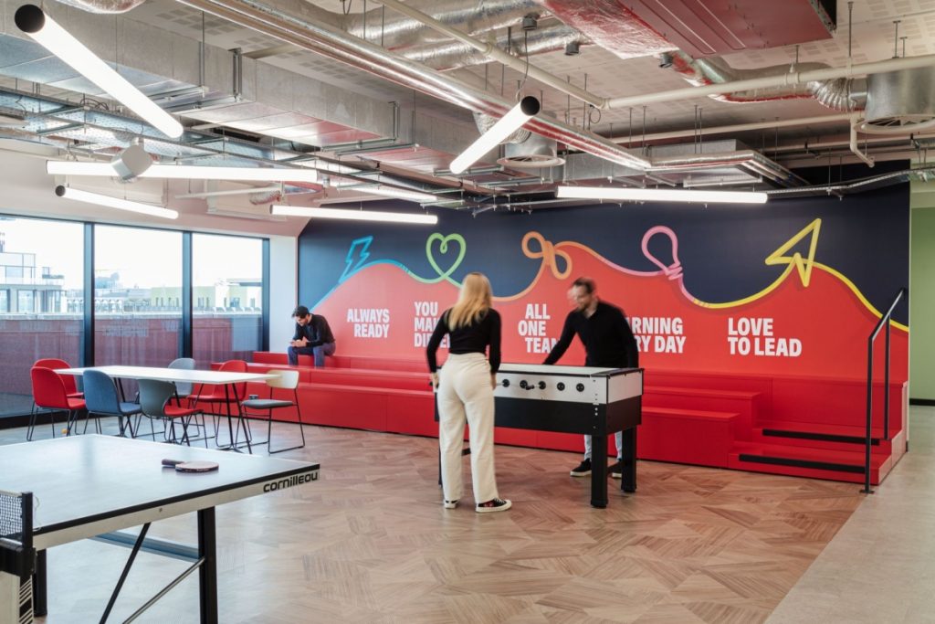
Tiered-seating, auditorium seating, bleachers—whatever you call it, it’s here to stay. Bleacher-style seating have emerged as a break from corporate aesthetics. Its open and flexible design encourages interaction and collaboration, but the magic truly happens when you pair it with the right wall design.
Looking for inspiration? Check out these examples that will take your cafeteria, all-hands room, or breakout space to the next level.
Cover image: Auditorium with tiered seating at the Community Transit of Snohomish County Office in Everett. (Design: Ankrom Moisan. Photo: Aaron Locke).
1. Color therapy: Bold, abstract brand graphics
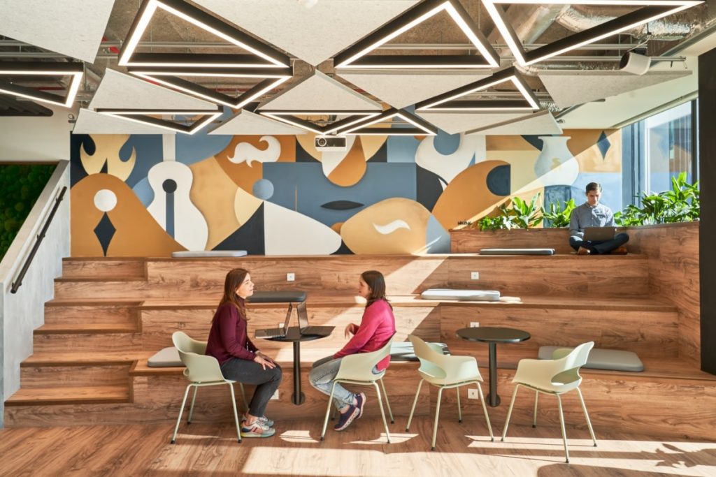
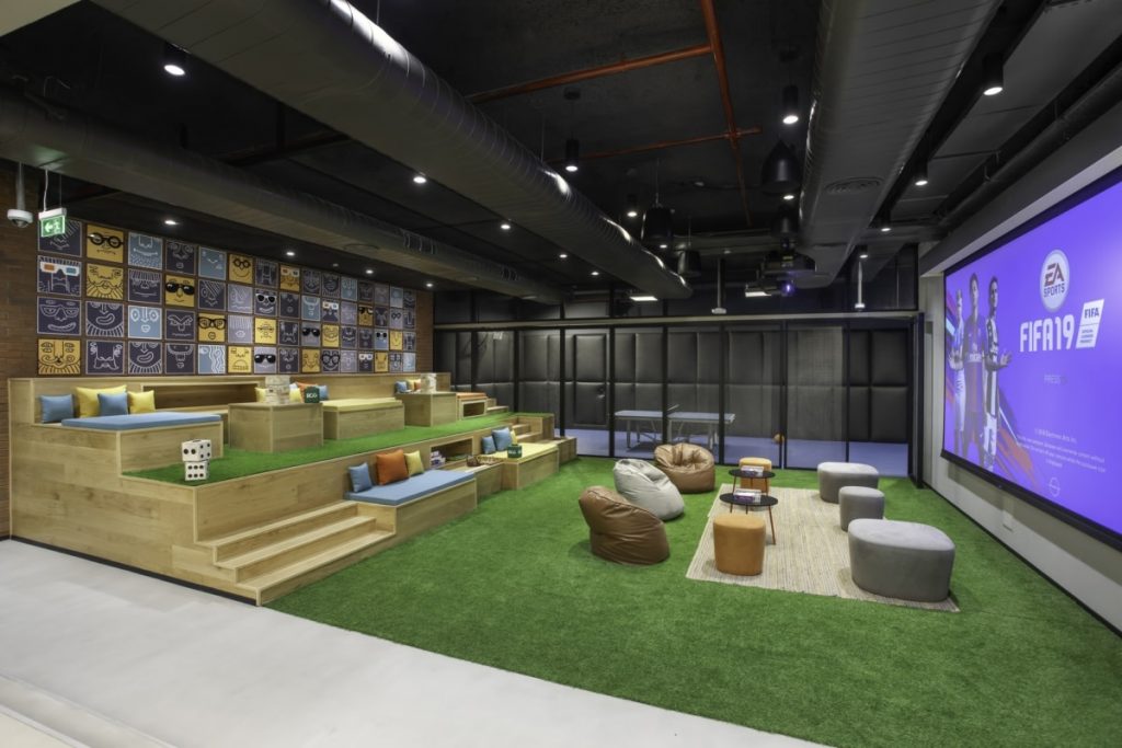
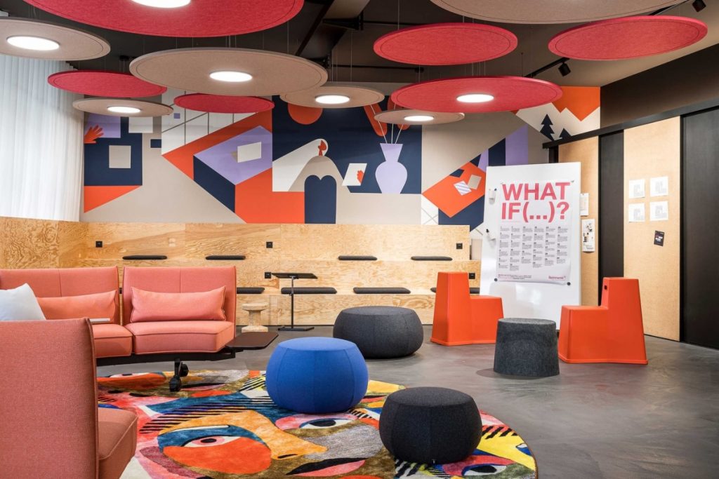
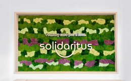
2. Get Creative: The Un-corporate logo
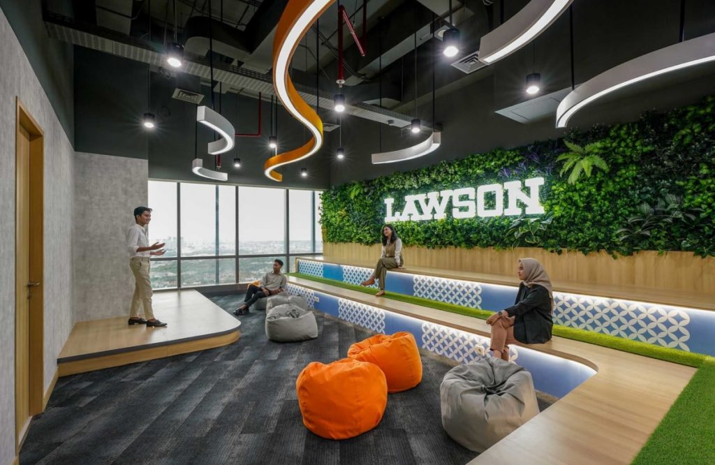
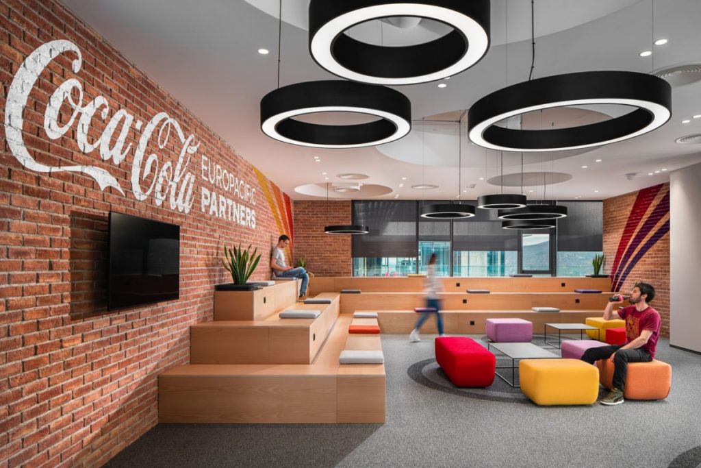
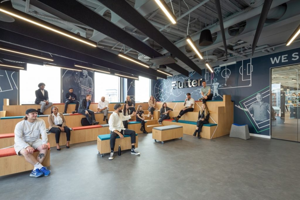
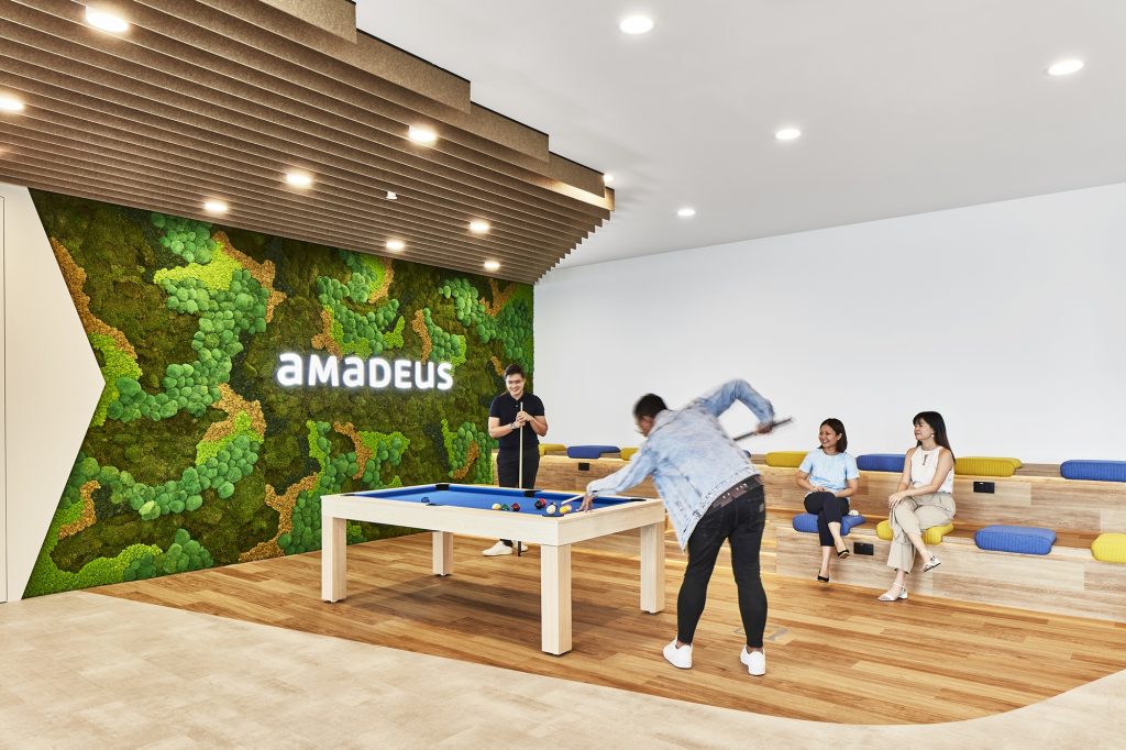
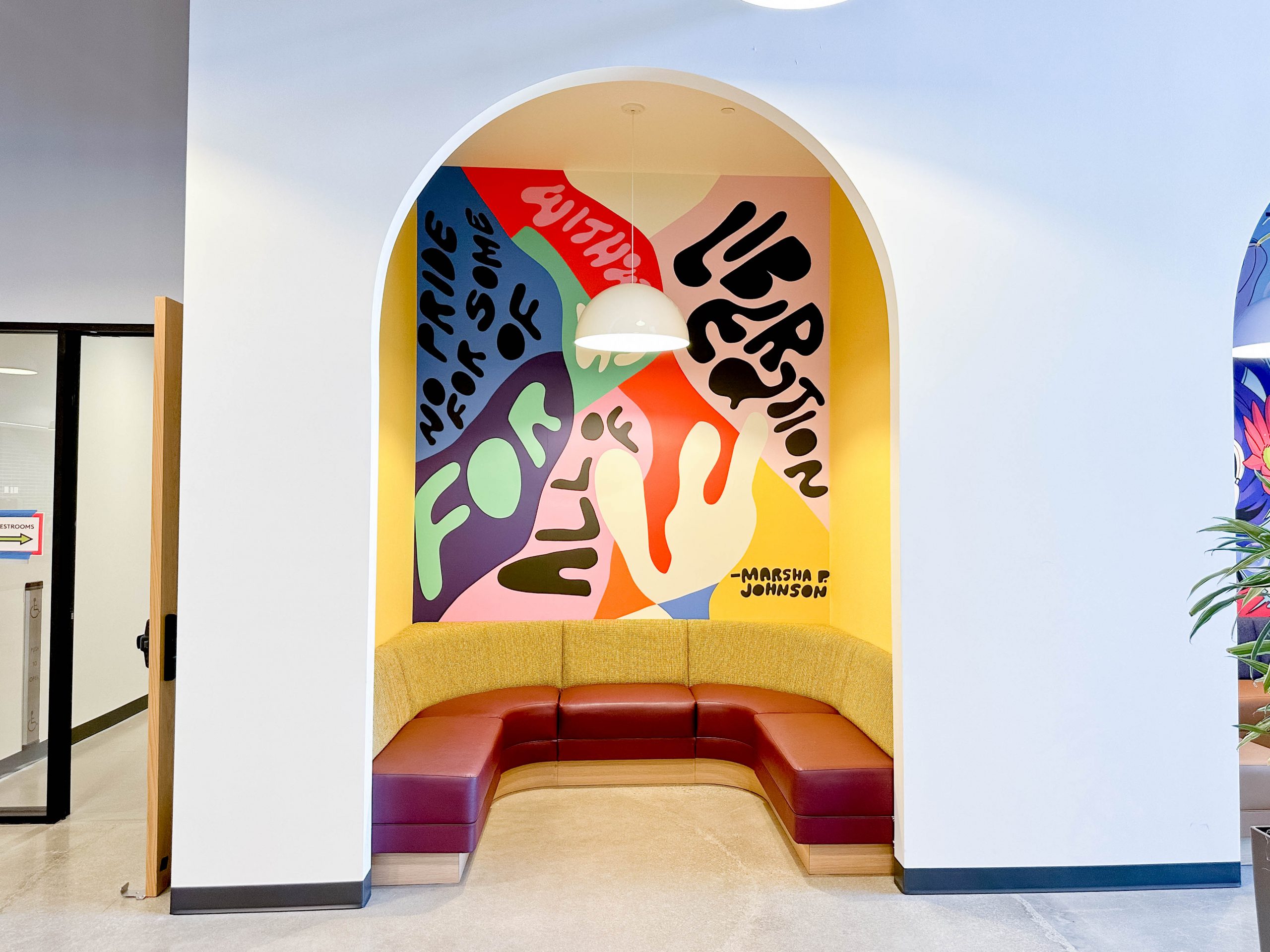
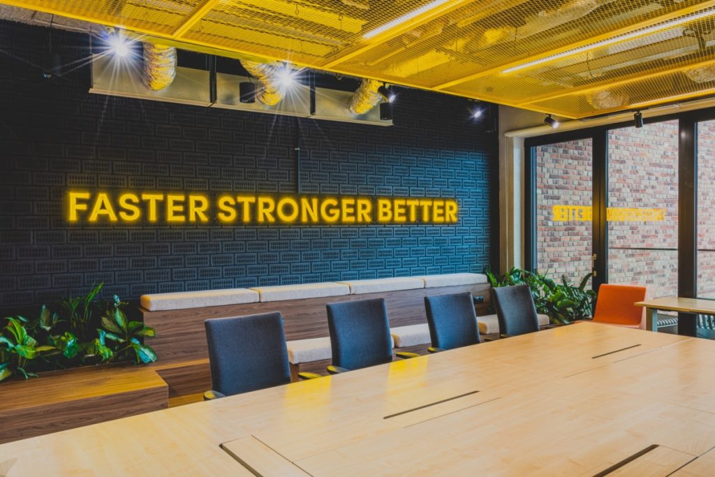
3. In the spirit: Slogans and values to inspire
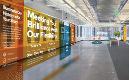
Wall art can serve as a constant reminder of your company’s journey, values, and vision. It can inspire your team, reminding them of the bigger picture and their role in it.
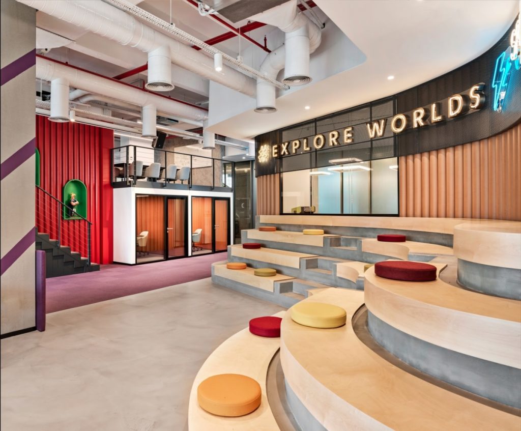
Conclusion
In the end, the right wall design for bleacher-style seating is not just about aesthetics. It’s about creating a space that inspires your team, fosters collaboration, and reflects the company’s identity.
Need more ideas?
Let’s chat. We’ve helped create branded walls for a variety of workplaces, and would love to hear about your brand and space challenges, even if you’re not sure what the next step is. Contact us at hello@tinkeringmonkey.com.
