The Secret To Quick Occupancy: 5 Reasons Why Commercial Properties Lease Faster With Tour Graphics

Go from empty to engaging in record time.

The Challenge

You manage an amazing commercial property that’s been sitting vacant on the market longer than expected. How do you get the right potential tenants interested in the property, visualize themselves working in that space, and eventually signing the lease?
The Solution

That’s where tour graphics come in. If done right, this can be the biggest game-changer in your leasing strategy. Visual tools can range from stunning 3D renderings to interactive floor plans, or even the visitor’s logo projected on the lobby wall (yep, we’ve done that). The idea is to paint a picture so enticing that potential tenants can practically see themselves signing that lease.

Colored acrylic panels with graphics suspended from celling at a property managed by Pembroke, an international real estate advisor that acquires, develops, and manages properties. The panels contain quick facts that different prospects would be interested in, reinforcing the idea of 100 Cal being the clear choice for their future. (Design: HZ)

Reason #1: Make a memorable first impression

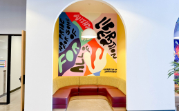
The last thing you want is for your space to feel underwhelming. Whether it’s a bold mural in the lobby or subtle branding elements throughout, eye-catching visuals transform an empty space into a memorable experience.

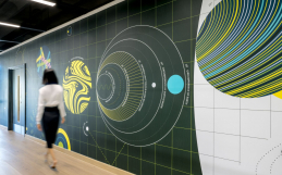
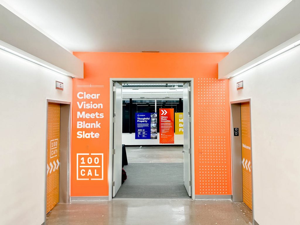
Bold entrance wallcovering in elevator lobby at a property managed by Pembroke, an international real estate advisor that acquires, develops, and manages properties. (Design: HZ)

Reason #2: Highlight key property features

Words can only convey so much. With visuals, you can highlight different aspects of the space—the natural light in the conference room, the sleek design of the interior, or the thriving community outside. It’s not just about showing a space; it’s about cultivating an emotional connection.

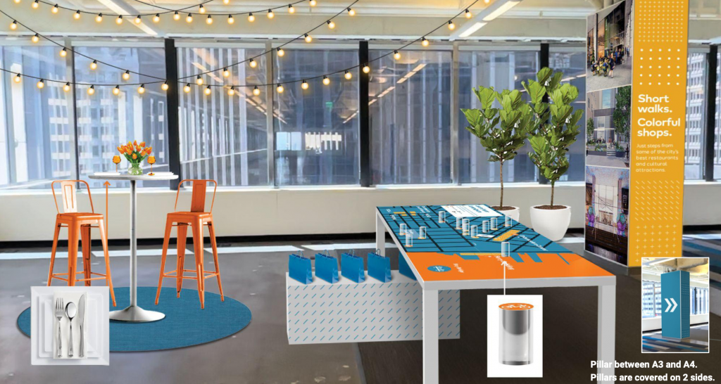
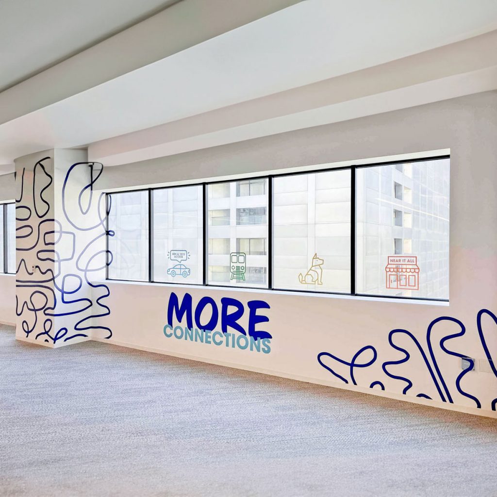
Custom column wrap with bold graphics at a property managed by Pembroke, an international real estate advisor that acquires, develops, and manages properties. (Design: HZ)
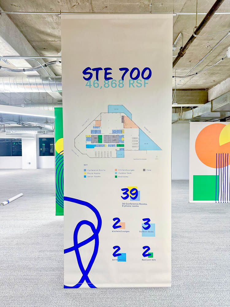
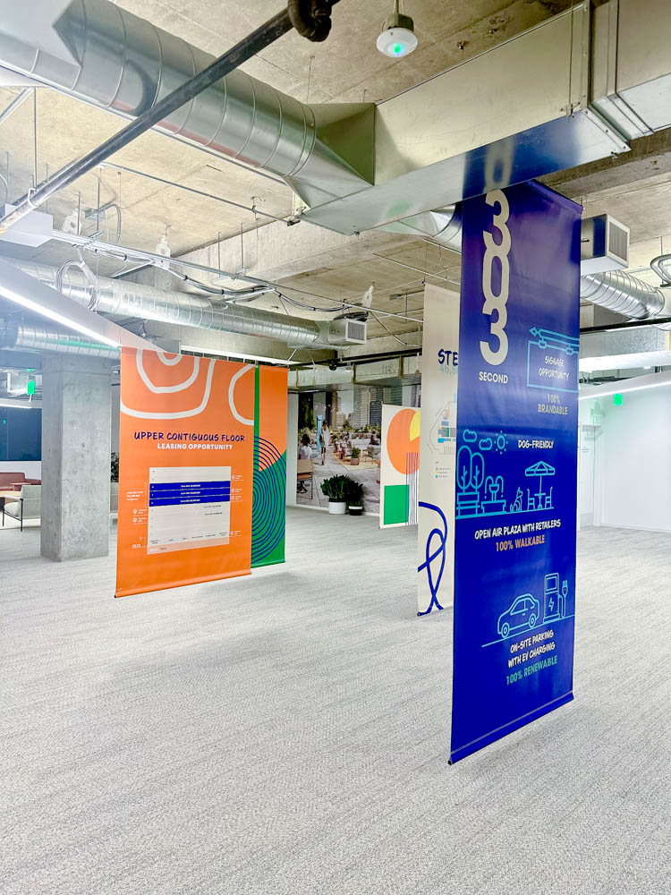
Dramatic floor to ceiling suspended event banners for Kilroy Realty, a property management company in San Francisco, CA.

Reason #3: Attract the right tenants

Let’s not forget that properties aren’t one-size-fits-all. Custom graphics allow property managers to set the tone for the kind of tenants they wish to attract. A tech start-up might be drawn to a space with modern, innovative designs, while a law firm might prefer a more traditional, elegant look. Tenants are more likely to stay in a space that reflects their brand and values, reducing turnover.

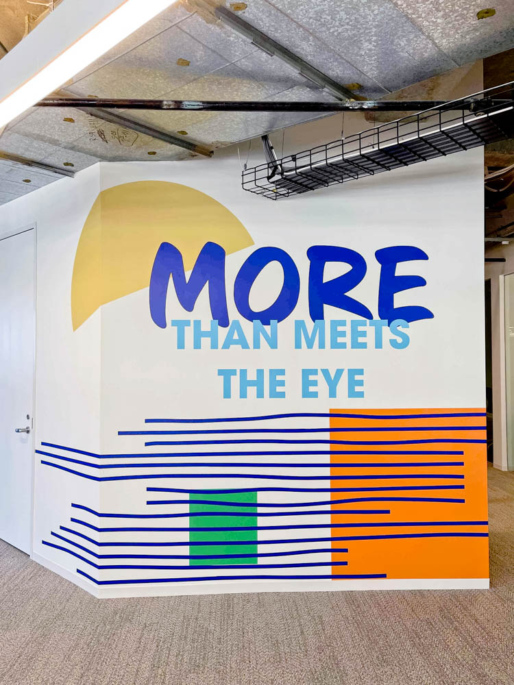
Colorful temporary wall coverings at a property managed by Pembroke, an international real estate advisor that acquires, develops, and manages properties. (Design: HZ)
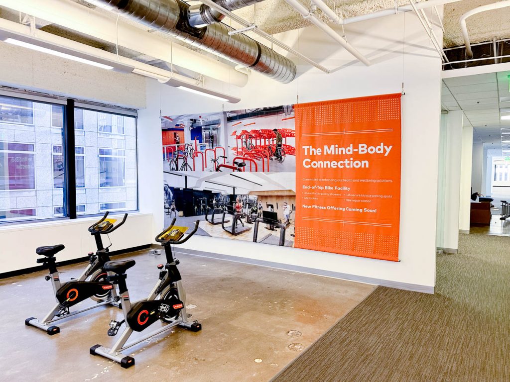
Commercial real estate tour graphics showcasing property features of vacant units for Kilroy, a property management company in San Francisco, CA,

Reason #4: Aid in navigating the space

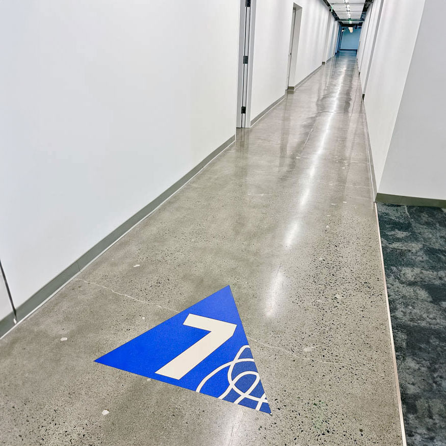
Wayfinding graphics can be used to aid navigation during broker tours, ensuring that every corner of the property is explored and appreciated. This is particularly helpful for larger spaces where navigation might otherwise be a challenge.
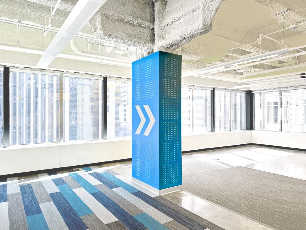
Custom column wrap with bold graphics at a property managed by Pembroke, an international real estate advisor that acquires, develops, and manages properties. (Design: HZ)
Commercial real estate tour graphics showcasing property features of vacant units for Kilroy, a property management company in San Francisco, CA,
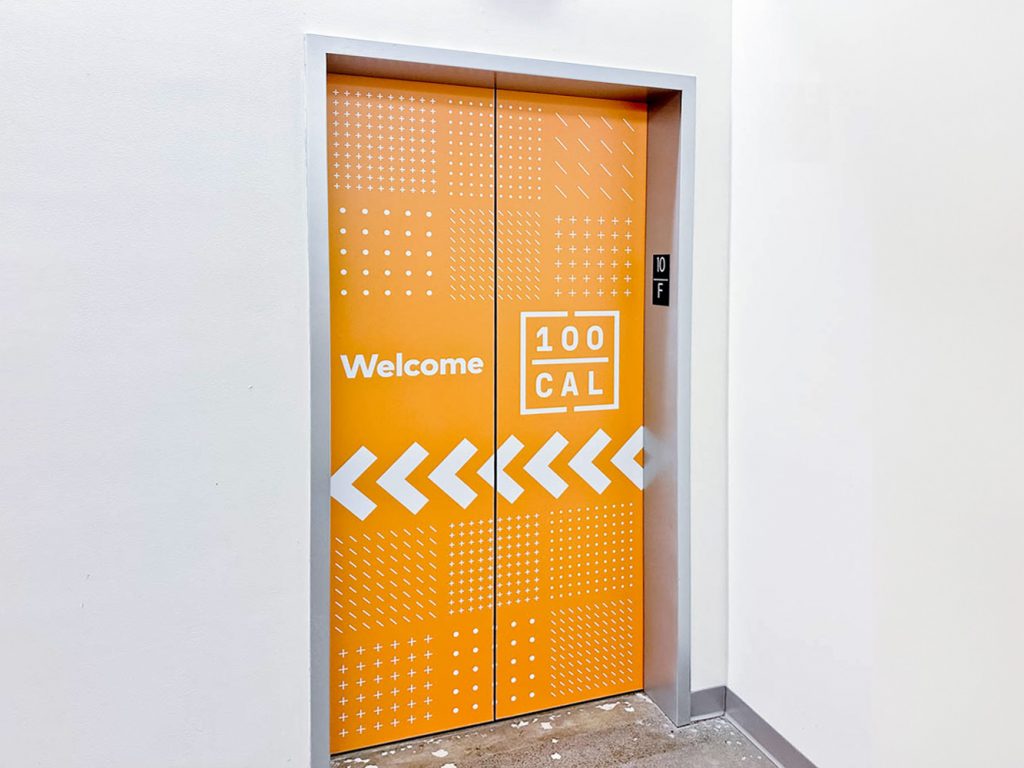
Colorful vinyl graphics on elevator doors at a property managed by Pembroke, an international real estate advisor that acquires, develops, and manages properties. Colorful welcome graphics set the tone for a bold and positive branded experience, while plexi arrows outside the room indicate the direction of the tour. (Design: HZ)

Reason #5: Maximize ROI

With the current saturation of the real estate market, graphics are an investment in the property’s appeal. Visitors are more likely to remember a property that highlights the space over one that didn’t put in the effort. And the best part? While it’s all temporary—the graphics can be made reusable for future vacancies.
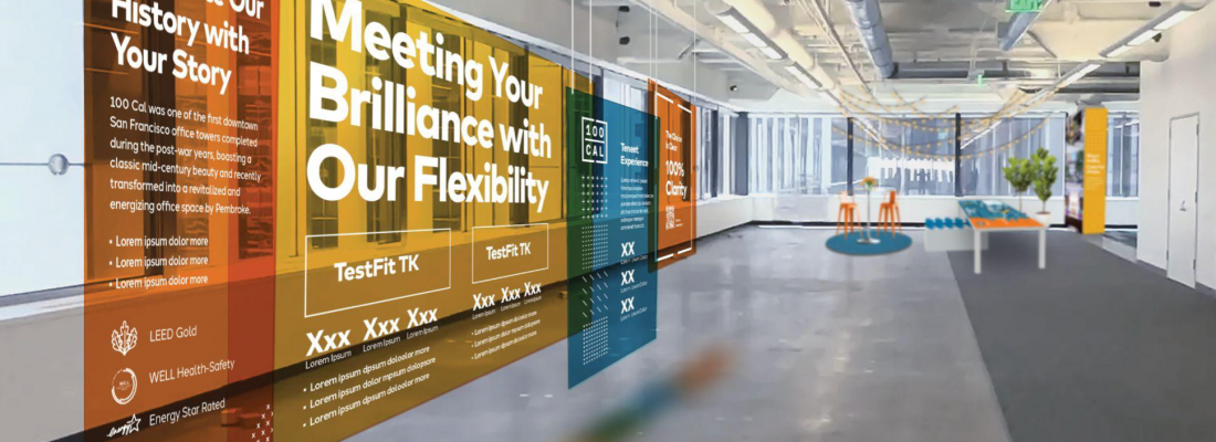
Commercial real estate tour graphics showcasing property features of vacant units for Kilroy, a property management company in San Francisco, CA,
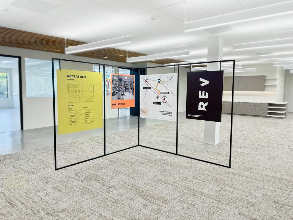
Freestanding event posters for Kilroy Realty, a property management company in San Francisco, CA.

Small investment. Big impact.

Ready to sign leases faster—and at premium rates—than ever expected? Let’s chat. In this competitive market, a little creativity can go a long way.

Dramatic floor to ceiling suspended event banners for Kilroy Realty, a property management company in San Francisco, CA.
Related Posts

Let's build something great together.

Whether you're starting new, empowering a team, or making a first impression—count us in.